(1) Advanced gray adjustment method
1, fruit yellow = medium yellow + meat
2, yellow gray = flesh color + lemon + white + sky blue (a little)
3, Egyptian gray = earth yellow + olive + white
4, swan ash = gray + pink green + sky blue + white
5, cold solid ash = earth yellow + yellow green
6, highlight gray = white = sky blue
7, blue gray = pink green + lake blue = white
8, ice pear ash = olive + medium yellow + earth yellow
9, purple gray = rose red + sky blue + white
10, apple ash = yellow-green + medium yellow
11, crystal ash = olive + white
12, green gray = olive + yellow green + white
13, green putty ash = dark green + earth yellow + rose
14, warm green = medium green (more) + dark red (less)
15, banana ash = lemon + yellow-green + white
16, clay ash = ochre + violet + dark green
17, warm pear ash = earth yellow + olive
18, Pacific gray = green lotus + sky blue + puran + pink green
19, Valanhui = plain blue + pink green + violet (less)
20, gray ideal orchid = lake blue + rose

21, watermelon red = big red + lemon
22, gray ideal purple = rose + sky blue
23, cold heavy ash = black (diluted) + plain
24, warm heavy ash = black (diluted) + deep red
25, Napoli yellow = white (more) + lemon + meat
26, Hu blue gray = hu blue + pink green + sky blue
27, soil yellow = ochre + meat + rose (a little)
28, red fruit ash = meat (more) + orange red + dark red + sky blue
29, into ashes = meat + orange red
30, red putty = crimson + olive
(2) Color grading theory
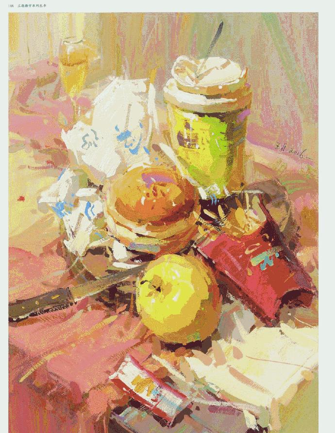
1, apples, the nest deepened green, not too ripe.
2, orange, bright part without white, orange and lemon yellow / light yellow. Add orange red and green gray to the bottom, olive green to the dark part, reflective, purple red, green purple gray, and add light yellow or yellow green. Ochre/cooked brown plus clear lotus hook bottom edge.
3, pear, medium yellow, earth yellow, a lot of white, [cold white, white with a little blue]. Pear handle: olive green plus earth red [can extend to any object with a handle], red in the nest, light green.
4, the glass, first draw the drink inside and the things behind, and finally a little green ash to check.
5, bread, inherent color [ orange, add earth yellow, add medium yellow ] bright part [medium yellow plus lemon yellow plus white] dark part [cooked brown plus earth red (small amount) plus earth yellow (small amount)].
6, potatoes, intrinsic color [soil yellow plus cooked brown plus ochre] bright [earth yellow plus white plus a small amount of medium yellow] dark part [cooked brown plus a small amount of crimson].
7, egg yolk, inherent color [medium yellow plus lemon yellow] bright [medium yellow plus a small amount of lemon yellow plus white] dark part [orange plus medium yellow plus earth yellow].
8, tomatoes, bright [rose red plus vermilion plus hundred plus yellow] excessive [big red plus rose red], junction [deep red plus grass green plus ochre cooked brown] reflective [earth yellow plus grass green plus yellow green] protruding yellow.
9, pumpkin, bright and warm yellow orange yellow flesh color, dark plus bright purple gray.
10, eggs, bright [dry yellow plus flesh color plus a small amount of purple plus white] intermediate color [earth yellow plus cooked brown ochre] dark part plus ochre.
12, carrot, bright [orange plus lemon yellow plus light green] excessive [grass green plus orange red] dark [ochre plus cooked brown]
13, dark jar, the darkest part [dark red plus blue] bright part [ochre plus earth yellow] excessive [earth yellow plus ochre plus cooked brown plus a small amount of purple]
14. Blue cloth
a. The direction of the vertical cloth fold in the direction of the inherent color [a little pure blue plus a small amount of flesh color].
b, the ambient color The color on the surrounding objects is adjusted into the inherent color of the cloth.
c, gray: reduce the purity, blue cloth bright part of the flesh color. Add purple ash in the middle, green purple gray in the distance, and purple gray in blue.
d, the dark part: the blue deepens the red, use a small pen to live a little, less excessive. The front contrast is weak and the back contrast is weak, and the dark part is browner than the ochre.
15, red cloth, inherent color [positive red plus teeth (more) yellow plus earth yellow (less) plus white (less) inherent color more than 60% of the ambient color less, gray more dark cloth less.
Ambient, bright, yellow-green, ochre light green purple gray
Dark parts plus blue deepen green, olive green
Brightening part, intrinsic color plus a small amount of white/flesh color/lemon yellow/beige, cloth in front of the object to brighten the light source is unified, shadow weight.
16, yellow cloth, bright, yellow plus a small amount of white/flesh color.
Dark: Yellow plus violet false small amount of blue.
(3) Draft
There is no fixed method for the color of the draft, and the main color of the picture can be seen.
Warm ochre to cold paint blue, color dilution side stroke.
First locate the angle, and then measure the proportion and look carefully.
The drawing shape adopts auxiliary lines, and the shallow and large shapes are changed deeply.
Finally, according to the light and dark side, draw a sketch feeling.
(4) Coloring
The artboard is graded according to the key, from dark to light.
The projection color should be thick first, one deep, two light and three tones.
Careful color grading and careful observation, bold strokes and bold strokes.
Complete the projection painting dark side, light and dark junction pen good.
Color gradients have transitions, and ambient color changes are extremely important.
The color on the bright surface is connected, and the relative dark color is monotonous.
The color configuration is exquisite, and the basic concept should be known.
First look at the hue to find the difference, the color change tends to be finely compared.
Look at the brightness to find the shade, and the same color must be not confused.
After looking at the purity is divided into light and dark, before high and low noticed.
The color should also have an echo, combined with the adjustment to unify the draft.
It is not enough to understand the above, but also to understand the main color.
Different tones look at the area, and find the color according to the tone.
(5) Adjustment
The coloring stage must be fast, roughly laid out and then finely adjusted.
To see if the hue is accurate, the color change should be thick and the water should be less.
Second, the brightness is better than the sketch, and the light and shade feel better.
Three looks at the details can be drawn, and the finishing touches should not be forgotten.
Fourth, whether there is a sense of space, the front is real and the back is virtual can be confused.
Five look at the whole color is not chaotic, cold and warm tones to grasp well.
The steps are skillful to do first, and then seek skill to draw high.
(6) Use a pen
Color sketching speaks to tone, and it is also important to use a pen at the same time.
The shape and texture all depend on it, different methods to know.
Generally, the object is swinging with shape, and the interlining is more likely to use a kneading pen.
Small flower scraps are picked up, and metal glass can be brushed.
Fine things small pen tick, highlights lightly wiped well.
The whole brushstroke is changed in the middle, and the picture is enduring and feels wonderful
(7) Faults
There are many problems in beginner sketching, and the corrective methods should be remembered.
First, the color is too monotonous, and the environmental color is more to find.
The second is that the color is too pink, and the abuse of white is too bad.
Third, the color is too bright, and the problem is that the purity is high.
Fourth, the color is too dull and dark, and lightening and highlighting can be changed.
Fifth, the color is too gray and dirty, and the pen is changed without washing.
Sixth, the color is too fancy, and the environmental color is painted more.
(8), paintings
1. Metal objects:
Glossy towards the choice of brush, painting accurate structural force to arrive.
There are large differences in depth and shallowness, and the highlights must be high in purity.
The reflector shape is too clear, and the color is prominent.
2. Transparent objects:
With a pen method such as metal, the color aberration is reduced just right.
Transparent vision is a feature, and the shape of the water insert changes.
Colorless transparent objects, background synchronization method is clever.
In case of semi-obscured objects, the internal and external color differences are noted.
3. Ceramic objects:
Although there are not many shades, the highlight color should be known.
Although the reflective environment color is bright, the shape of the object is confused.
The fine pattern is left alone, and then the overall drawing is carefully drawn.
4. Cloth objects:
The color of the cloth looks at the tone, and the uniformity has changed although it has been spent.
The pattern only needs to be roughly drawn, and the overall consideration should not be too jumpy.
Fold complex Don't worry, just take the main house.
5. Vegetable and fruit objects:
The fruit grasps the basic color, and the light and dark are well connected.
Reflective attention to the ambient color, too bright flowers do not.
Vegetable varieties are mixed, and it is especially necessary to pay attention to large colors.
Fine lines or add while wet, or to dry after the pen swipes.
6. Flower objects:
The first leaves and then the flowers are in order, and the large flowers are left small.
Flowers and leaves must be distinguished, and the flowers are bright and dark is the tone.
The dark side of the big flower can be slightly changed, and the small flower is simple and dark.
7. Book and paper objects:
Generally speaking, the reflection of book paper is weak, and the environmental color is not important.
The difficulty lies in the words and paintings, and the overall color is grasped well.
The picture object finds the shape, and the small places are omitted.
Large characters use checks and fills, and smaller characters are on the line.