On August 25, we received a tip that China Unicom was updating its brand image, including revising the brand color and launching a new brand slogan.
Since there was no relevant content support at that time, we suspended the publication of this article.
And just this morning, Unicom announced that the brand renewal officially announced the new version of the LOGO, so this article that has been in the draft box for more than a month can come in handy.
Although the graphic proportions of Unicom's newly revised LOGO and the fonts in Chinese and English have not changed significantly, the iconic "China Red" brand color has been adjusted.

The "Chinese Red" color value used in 2008 is CMYK: 0,100,100,10, and the adjusted new red color value is CMYK: 0,100,85,0.
Compared with the previous darker red, the new red (new technology red) is brighter and brighter, and it also feels younger and more affinity.
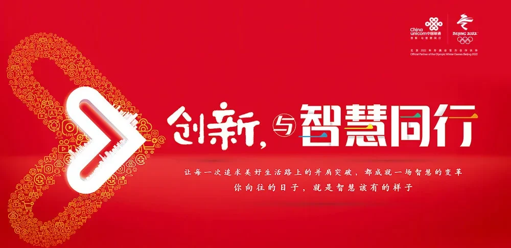
In addition to the brand color update, we have noted that China Unicom will also launch a new brand slogan of "Innovation and Wisdom". From "innovation and changing the world" to "innovation and wisdom", it can be seen that Unicom has empowered the industry and served users' brand spirit and brand attitude through the 5G era.
Adopt the new red China Unicom logo
Unicom explained that "innovation" is the core gene of China Unicom and needs to be continuously inherited. "Wisdom" expresses The brand spirit of "Co-creation and Sharing" of China Unicom. "Peers" embodies the rich connotation of China Unicom's brand humanistic care and warm brand image.
New and old brand colors
In addition, we have noticed that Unicom has also derived more brand graphics based on brand icons, such as the "arrow" graphic meaning progress and breakthrough, expressing Unicom's attitude towards future development; "love" means intentions and responsibility, expressing the relationship between Unicom and people and society; and the "infinite" symbol means to work together and walk together to express the ability to create infinite possibilities.
Brand graphics
<h1 class="pgc-h-arrow-right" > the history of Unicom's brand symbol</h1>
The China Unicom logo, which we are currently familiar with, was originally designed by mr. Li Zhongfa, a visual artist and famous stamp designer, and the design was inspired by the Chinese coiled culture. Coiled entanglement is a long-standing imprint of traditional Chinese culture, with the significance of information transmission, interdependence, and never-ending.
In the design, the designer cleverly integrated the graphic freehand of "heart-to-heart communication", accurately interpreting the service attributes and emotional awareness of the communication industry.
Since March 28, 2006, China Unicom has launched a new logo and brand slogan "Let Everything Connect Freely" based on "China Red" and "Ink Black", and the icon continues to use the long pattern of "Chinese Knot, Concentric Knot". Its red Chinese knot symbolizes happiness and good luck, and its black text symbolizes tolerance and cohesion.
The two red "i" in "China Unicom" take the form of being connected up and down, implying communication. The new logo is also different from the blue logo of other communication operators, which is more eye-catching and distinctive.
According to the information at the time, China Unicom positioned the new brand as "innovative, dynamic and fashionable". In particular, the new logo is connected by a red double "i", and Unicom explains that "i" is pronounced "love" in Chinese, which fully expounds the brand concept of "heart and heart are connected and closely connected".
In addition, "i" is interpreted in English as "I-I" and "Information-Information", which is the embodiment of China Unicom's brand marketing philosophy of "customer-centric" and "providing customers with integrated communication and information services".
In June 2008, China Unicom sold its CDMA network assets and business to China Telecom and merged the remaining assets and business with China Netcom (CNC) in the form of a share exchange, and the new company name was "China United Network Communications Co., Ltd.", which is still China Unicom.
On October 15 of the same year, China Unicom released a new logo, although the overall design of the 2006 version was still followed, but the Chinese and English fonts of "China Unicom, China Unicom" were redesigned, especially the font of the four characters of "China Unicom" almost reproduced the font of the original "China Netcom" company logo in terms of shape.
After 12 years, Unicom will upgrade the long-used main color of "Chinese Red". As of now, the new version of the logo after Unicom adjusted the color has not been announced to the public, and the color value mentioned in the above content is only for reference and exchange. The standard design style and related data are subject to the content of the official final announcement, thank you for understanding.
<h1 class="pgc-h-arrow-right" > references:</h1>
Interpretation of Unicom's Replacement Brand Identity: A New Beginning for a New Image (2006)
Unicom says this year is a key year for transformation, and the structural adjustment of the department has been completed (2006)
Unicom Netcom officially merged today Netcom brand withdrew from the historical stage (2008)
Without permission, please do not copy and reprint directly, thank you!
The copyrights of the trademarks and images appearing herein belong to their rightful holders and are for informational purposes only, not for commercial purposes. If you do not intend to infringe on your rights and interests, please contact us in time to deal with it.