With the continuous development of urban construction, major cities in the mainland have launched their own urban image logos, on the one hand, as a publicity symbol for tourism promotion, on the other hand, they also represent their own urban image. Today, Xiaobian has selected several more interesting city logos, which are cleverly designed and reveal different urban characteristics.
Come and choose the most beautiful city LOGO in your mind!
NO.25 Chongqing
Chongqing
2004
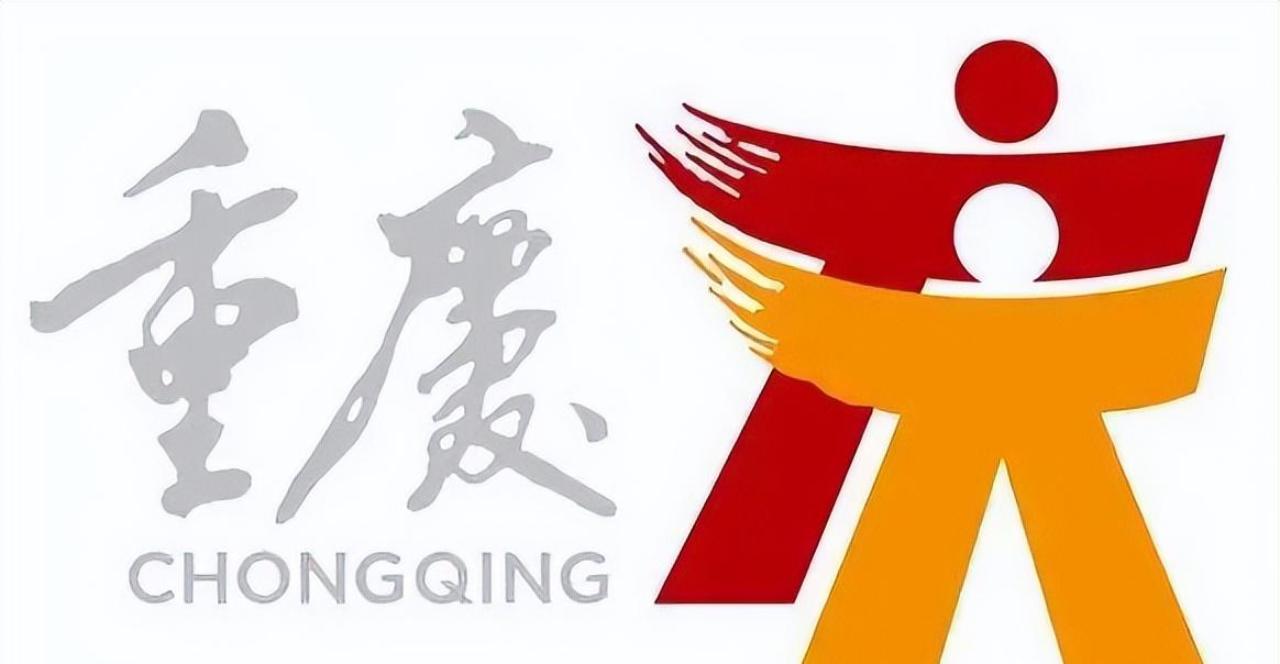
Chongqing city image LOGO is designed by Jin Liugao Design Company. With "double celebration" as the theme of creation, two joyful people form a "qing" character, which tells the historical origin of the name of Chongqing. The logo takes "people" as the main visual element, showing the spiritual concept of "people-oriented" in Chongqing. Red represents strength, and yellow represents the fashion of the city. The auxiliary pattern of the image logo takes the historical origin and spiritual connotation of bayu culture as the design elements. Deng Xiaoping's xingshu "Chongqing" is the Chinese standard font for the logo.
NO.24 Hangzhou
Hangzhou
2008

The original designer of Hangzhou City LOGO is Xie Jianjun, founder of Beijing Dongdao Image Design and Production Company, which is like a ship as a whole, and the ancient meaning of "Hang" is "Ark" and "Boat"; "Hangzhou" and "navigation" reflect the historical allusion that Hangzhou got its name from the "Dayu Shezhou Landing", reflecting the heritage of Hangzhou as a historical city; it also symbolizes that Hangzhou is setting sail today, showing a positive and enterprising spirit. The bottom Chinese and English fonts bear the name of The city of Hangzhou.
NO.23 Hong Kong
Hong Kong
2010
"Hong Kong Brand" was updated by Hong Kong designer Chen Youjian on the basis of the original LOGO, and the original Wyvern pattern was retained after the update, but it looked more modern. The blue and green ribbons extended by the flying dragon represent the blue sky and green space and the sustainable environment respectively, while the red color belt outlines the ridgeline of Lion Rock, symbolizing the fighting spirit of Hong Kong people "I can do it". The ribbons are flowing and flexible, representing the flexibility of Hong Kong people, while the colorful colors represent the diversity and vitality of the city.
NO.22 Sanya
Sanya
2010
Sanya's international tourism image LOGO is divided into two parts, the first part uses the Chinese pinyin "Sanya", the upper part of the "S" resembles a fire phoenix, inspired by the slogan "Phoenix Dance Heaven" when Sanya was first transmitted in the territory of the 2008 Olympic Torch; the lower part is like a wave, highlighting Sanya's marine characteristics. The second part is the word "Sanya" written with a brush, highlighting the elements of Chinese culture. The small red seal next to it, "Tianya", comes from the word "Tianya" on the famous Tianya Haijiao Stone, and the shape of the seal comes from another famous "South Heaven Pillar" stone in Sanya.
NO.21 Chengdu
Chengdu
2011
The chengdu image LOGO is the sun god bird, and its core pattern is composed of the gold jewelry pattern of the "sun god bird" in Jinsha and the combination of "Chengdu" Chinese and English standard characters. The Jinsha Sun God Bird Cultural Relics were excavated from the Jinsha site in 2001 and are a symbol of Chengdu's long history and splendid culture.
NO.20 Dongguan
Dongguan
2011
Dongguan city LOGO design with green, blue, red, orange and other four colors as the main color of Dongguan city, with Wanxiang flowers as the logo design prototype. Guanxiang is the only tree named after Dongguan place name, is a unique resource in Dongguan, and can be more directly associated with Dongguan in the promotion process. The two blooming Flowers of Wanxiang have the meaning of vitality, and the clusters of flowers symbolize the development trajectory of Dongguan's "group-style".
NO.19 Shenyang
Shenyang
2013
Selected from more than 200 collected works, the designer of the Shenyang City LOGO is named Fan Zhiwei. The red auspicious clouds dancing on the LOGO are like a blooming rose, and the center is the silhouette of the Grand Palace hall of the Imperial Palace in Shenyang, and the four words of "Vibrant City" spliced together with geometric shapes mean that "industrial tourism" has become a unique scenery of Shenyang's characteristic tourism.
NO.18 Lanzhou
Lanzhou
2013
In the Lanzhou city image LOGO, the use of blue, yellow and green brushstrokes represents the blue sky, the Yellow River and the green space respectively, symbolizing the harmony of heaven, earth and people. Among them, the yellow color is centered, which means the landform of Lanzhou with two mountains and one river, and the statue of the Yellow River mother embedded in the three strokes highlights the important position of Lanzhou as the capital of the Yellow River. The base of the sculpture is processed as a rushing wave, symbolizing the yellow river's eastward and westward development. The Majiayao ornamentation in the brushstroke highlights the Yellow River civilization, and the lower part of the LOGO is the handwritten calligraphy font of "Lanzhou, China", and the lanzhou city image slogan "Jincheng Lanzhou, the capital of the Yellow River".
NO.17 Wuhan
Wuhan
2014
Wuhan city image LOGO design scheme comes from the design team of Beijing Popular Communication Agency, the main body of the LOGO selects the more culturally inclusive traditional "Han" that can represent Wuhan, with the seal book "Han" character as the main body, integrated into the Connotation of Wuhan Jianghan Dynasty, Chu han Context, Central City, etc., with Chu Hong as the main color tone, and integrates the calligraphy English font "WUHAN".
NO.16 Qingdao
Qingdao
2016
Qingdao City LOGO "Qingdao Classic" was designed by designer Han Jiaying. The integration of "red tiles and green trees, blue sea and blue sky" and Qingdao mountains, seas, cities, sails and other characteristic urban elements shows the connotation and vitality of the entire city.
NO.15 Guangzhou
Guangzhou
2017
The Guangzhou city image LOGO is designed by Professor Cao Xue of the Guangzhou Academy of Fine Arts. The LOGO is composed of the word "Guangzhou" into the graphic of Guangzhou's landmark Canton Tower. At the same time, the word "Guangzhou" is like a sail and a bird coming from south to north, showing a prosperous scene of a thousand-year-old commercial capital with hundreds of rivers and rivers. The entire graphic highlights the characteristics of an international, smart city.
NO.14 Yantai
Yantai
2017
The main body of yantai LOGO is a rectangular card design, and its core part is Yantai Mountain Lighthouse, a landmark building in Yantai, and the blue ink brushstrokes design the outline of Yantai map, resembling blue sky and blue sea. The map of Yantai is processed into ink form. The Chinese and English characters and red seals of "Yantai, China" are intended to jointly highlight the harmonious beauty of "Wonderland Coast Charm Yantai".
NO.13 Yiwu
Yiwu
2017
Yiwu LOGO city image logo is shaped like a running person, under the background of various graphic primary colors, rushing forward, intending to convey to people the spirit of positivity, hard work, enterprising, vitality, openness and enthusiasm. The moon flowers, camphor trees and the sun and the moon shine together, which is the geographical portrayal of Yiwu; the chirping birds embody the rhyme of humanity; the "rattle" and "chicken feathers for sugar" reflect the accumulation of traditional culture; Yiwu red represents the color of "Yiwu Three Treasures" (brown sugar, ham, southern jujube), and gold is intended to symbolize auspicious and shining future.
NO.12 Luzhou
Luzhou
2018
The design project of Luzhou City Image LOGO is designed by the City Brand Research Office of the National Image Communication Research Center of Tsinghua University, and the overall style is the seal seal style, and the "Lu" character is built with part of the strokes of the four characters of "China Wine City". The logo is intended to highlight Luzhou's rich urban temperament and highlight Luzhou's urban positioning.
NO.11 Shaoguan
Shaoguan
2018
The "Shanmei Shaoguan" city image LOGO processes the design technique of the pinyin "shao" of Shaoguan to form the "shan" character of the city of shanmei. The fusion of "Shan" and "Shao" in harmonic sounds and glyphs produces the theme pattern of "Shan Mei Shao Guan". There are four color groups in the LOGO: yellow, green, blue and red, which represent the humanistic history and natural forms such as Zen Buddhism, forest, water system, and Danxia.
NO.10 Climbing branches
Panzhihua
2018
Panzhihua City LOGO is inspired by the word "Yang", open hands, sunshine, flowers, the overall shape is like a blooming flower, and the bright sunshine also symbolizes the light of industry.
NO.9 Chaozhou
Chaozhou
2019
The Chaozhou city image LOGO is inspired by the overall impression of the "Five Elements Gable" (Cuojiaotou) and the East Gate Tower, combined with the image of "Guangji Bridge Eighteen Shuttle Boats" and the design image of "Twenty-four-story Terrace", which also reflects the spirit of "Dragon Boat Racing". The image of the pavilion layered upwards of the logo and the text shape of "Chaozhou China China Chaozhou" are symmetrically laid out, and the text and graphics are integrated to form a unified whole, implying that Chaozhou is on the next level. The color takes the color attribute corresponding to the five lines.
NO.8 Jinhua
Jinhua
2019
The overall shape of the Jinhua City LOGO is tower-shaped, and the graphic contains the words "Jinhua". It is inspired by Jinhua's most historic landmark building" "Jinhua Wanfo Pagoda", and is designed with Jinhua elements such as "Jinhua Mountain", "Bayong Tower" and "Wuzhou Park Traditional Arch". At the bottom of the figure is an abstract light boat, representing the river culture of Jinhua. The text section is centered on "China" and "Jinhua" with a red face representing the intangible cultural heritage of Wu opera in Jinhua.
NO.7 Cixi
Cixi
2019
The Cixi City Image LOGO is designed by the design team of the School of Design and Art of the China Academy of Fine Arts, with the first pinyin "C" of the city name "Cixi" as the creative core, and the elements of the eight-edged pure bottle are integrated into it. C is both Cixi and porcelain, and also represents China, indicating that Cixi was the starting point of the ancient Silk Road. The hollow in the middle of the pattern is the most well-known representative work of the secret color porcelain, "Eight Prism Pure Bottle", which complements the city slogan "Secret Color Porcelain Capital".
NO.6 Zhuhai
Zhuhai
2019
The Zhuhai City LOGO is designed by designer Lang Liqun, which is composed of three parts: the Hong Kong-Zhuhai-Macao Bridge, the Fisherwoman and the Green Water and Green Mountains. The "H" part on the left is simplified to the Zhuhai-Hong Kong-Macao Bridge, symbolizing the Zhuhai Bridge connecting the world and connecting the future, highlighting Zhuhai's unique location and historical opportunities in the Guangdong-Hong Kong-Macao Greater Bay Area. The right side is interwoven with colors and extended lines, symbolizing the green water and green mountains. The middle part of the LOGO is reflected by the Hong Kong-Zhuhai-Macao Bridge and the green water and green mountains, outlining Zhuhai's landmark fisherwoman.
NO.5 Seaside
Linhai
2019
The Linhai City Image LOGO takes the Chinese calligraphy of the pinyin initial L of Linhai as the creative main body, which means the grand scenery of the coastal sea of "qingshan entering the city, the river and water ringing Guo". The left part symbolizes the majestic And majestic Mountain Range, the right part depicts the long and winding coastline, the middle and lower part takes the scenery of the ancient Great Wall in Jiangnan, and the word "Linhai" at the bottom is taken from Mr. Guo Moruo's calligraphy ink treasure.
NO.4 Huzhou
Huzhou
2020
Huzhou city image LOGO on the basis of the original LOGO visual optimization, from ink to a simpler line modeling, through the gradient and gap of the line outlined the moon hotel, Feiying Tower, Taihu Lake three elements, asymmetrical lines also make the graphic more dynamic and dynamic. The Chinese and English fonts of "Huzhou" are consistent in style, and the arc treatment of the strokes makes the font more soft and comfortable. In the choice of colors, the main colors are divided into azure and lake blue, and are applied in a gradient manner in the graphics.
NO.3 Nanchang
Nanchang
2022
Nanchang city image LOGO is named "Feige Liudan", and its name is derived from the "Tengwang Pavilion Preface": "The layers are towering green, the upper is out of the heavy xiao, the Feige Liudan, and the lower is landless." In terms of design, the LOGO takes "Bayi Red" and "Yuzhangjin" as the main colors, and the four Chinese characters of "Bayi Nanchang" that have been deformed are laid out from top to bottom in an orderly manner to display the overall contour image of the Tengwang Pavilion building, and the red gene of Nanchang is artistically integrated with the historical heritage.
NO.2 Fuzhou
Fuzhou
2022
Fuzhou City Image LOGO "Blessed State" takes the Fuzhou City tree "Banyan Tree" and the ancient architectural feature "Saddle Wall" as the main body of creation, and integrates urban elements such as Fushan, Fushui and Fudao into it. Among them, the banyan tree shape symbolizes the indomitable spirit of Fuzhou and implies the meaning of "three mountains and one water"; the saddle wall outlines the unique skyline of Fuzhou's ancient home; the engraved seal pattern reflects the culture of Fuzhou Shoushan Stone; the English character highlights the goal vision of building a modern international city; "Fuzhou Blue" and "Rongcheng Green" are intended to highlight the good ecological and livable quality of Fuzhou as a green city and a demonstration city of science and technology.
NO.1 Chibi
Chibi
2017
Chibi city image LOGO was designed by Teachers of Wuhan Universities, the LOGO is based on the "Chi" character as the prototype, combined with the traditional Chinese water cloud pattern design, fully reflects the new image of the ancient city of Chibi and chibi "livable and livable" urban characteristics.