Heat maps are not just differential gene expression, they are used in the same field of machine learning
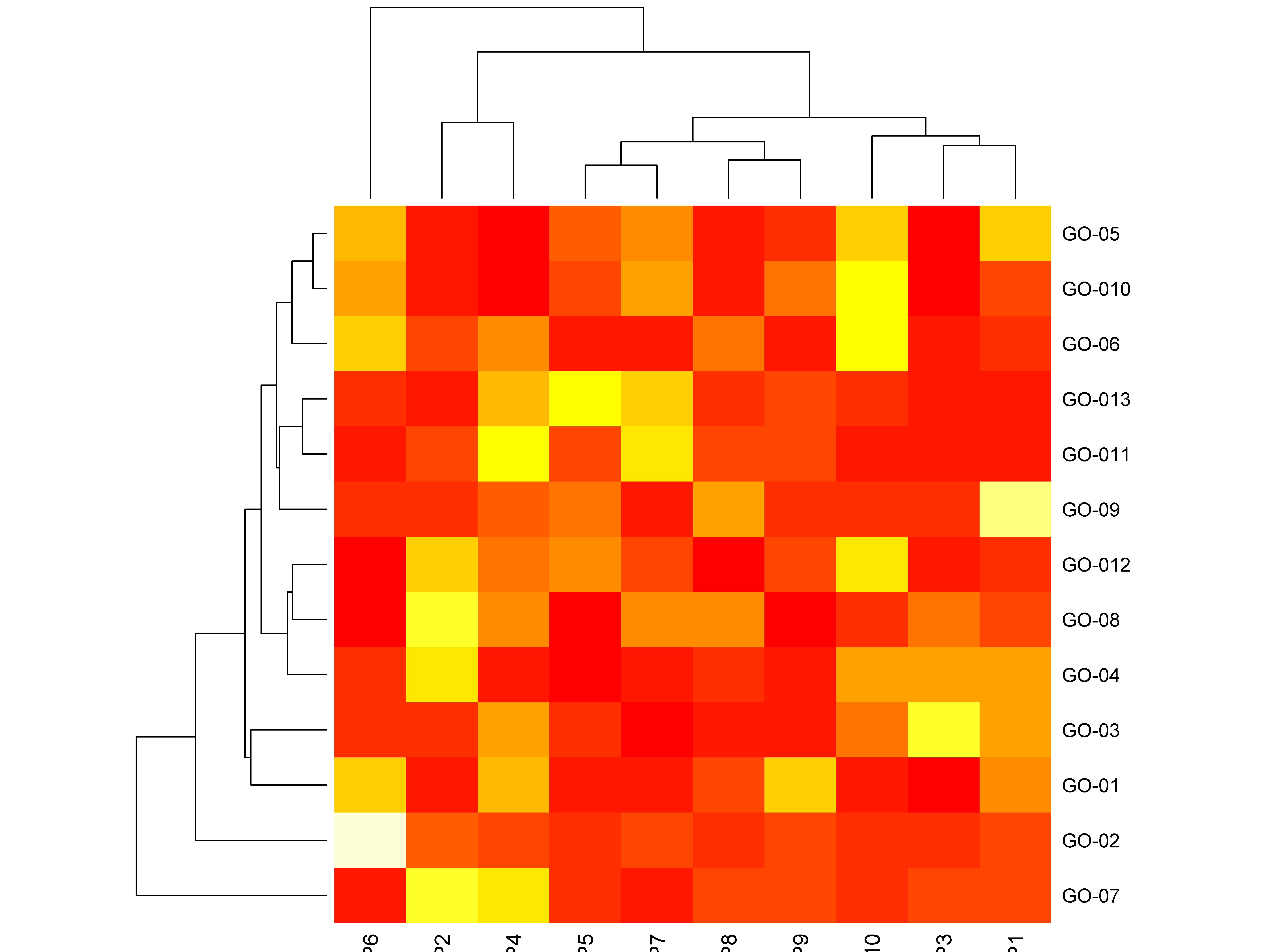
Heat maps can realize differentially expressed genes in the field of "shengxin" and show the expression levels in different grouped samples; generally a column represents a sample, a row represents a gene, and the colors in it represent the relative expression values.
In fact, heat maps are also closely related to "tall" chip design and machine learning; after all, the principles are the same, and the core things are only "a set of tricks".
In the field of chip design and machine learning, it is only necessary to correspond the name of the expressed information to "chip pin" ~ "level signal" or "image noise" ~ "algorithm", which can be achieved! R's biggest advantage is the ability to visualize data information.

Heat maps are essentially visualizations of clusters. In R, the base package stats provides a function of hierarchical clustering, hlust, which is an abbreviation for Hierarchical Clustering. The basic idea of this function is:
- Separate objects that need to be clustered as a cluster;
- Cluster the two most similar clusters into one category according to an algorithm (such as complete linkage);
- Repeat the 2 process until all clusters are clustered into one category.
Sunflower charts are used to overcome the overlap of data points in scatter charts
Sunflower plots, also known as sunflower scatter charts; sunflower plots use different characters in specific graphical positions.
library(car); cc<-Vocab; names(cc)
[1] "year" "sex" "education" "vocabulary"
plot(cc[,3:4],col=rainbow(22),cex=2,pch=17,las=1,col.axis='blue',ann=F,tck=0.01)
Dataset cc has a total of 30351 data points, which data points overlap in the above figure? The sunflower chart can use the number of petals of a "sunflower" to represent the number of overlapping data where there is overlap; the following figure can achieve a comparison of the overlap of scattered data.
sunflowerplot(cc[,3:4],seg.col='blue',cex=1.6,col='red')
The data point in the upper left corner of the figure has only the upper and lower petals, which means that the data point is greater than 10 and less than 10 has a data each; if there are many petals at a certain point, it means that the amount of data that overlaps left and right before and after the point position is larger; the blue solid circle indicates that there are many, many data points.
"Sunflower" of random data
aaa<-round(rnorm(100));aaa<-rep(aaa,5);aaa<-jitter(aaa,3);aaa
par(las=1,col.axis='lightblue',tck=0.01,ann=F)
sunflowerplot(1:500/500,sample(aaa,500),digits=1,pch=13,cex=1.1,col='red',seg.col='blue',seg.lwd=2)
sunflowerplot(rnorm(500),sample(aaa,500),digits=1,pch=19,cex=1.1,col='red',seg.col='blue',seg.lwd=2)
| digits | When the number parameter is not specified, the x data column is rounded to digits significant before the multiple is calculated. |
If the amount of data is not too large, you can use the "Axle Graph" method to display the distribution density of the data volume;
hist(cc[1:290,4],prob=T,breaks=9,labels=T,col=rainbow(9),ann=F)
rug(jitter(cc[1:290,4],amount=0.7), col = "red")
lines(density(cc[1:290,4]),col='blue',lwd=3,lty=3)
The petal chart fully demonstrates the grouping information
When the number of groups is greater than 5, the venn diagram even if it can be drawn, it looks very complex and not intuitive; in the actual data analysis, the situation that the group is greater than 5 is often encountered, then you can consider using the petal chart to visualize the data.
In the petal diagram, all samples have common information, but each sample also has unique information; the petal diagram is both beautiful and the information displayed is also intuitive. As shown in the following figure:
For related codes, see: R language to draw petals diagramflower plot - Luzhou moonlight - blog garden
The above figure makes systematic adjustments to the relevant parameters of the code, also adjusts some of the text content, and also changes the color display and graphic layout design; in fact, as long as you are familiar with the underlying drawing instructions, you can quickly achieve it.
The realization of the "circle chart" of the highest realm
"Circle chart" is especially suitable for gene expression in "life letter"; as long as the circlize package is installed, it is also a matter of minutes to achieve a seemingly extremely "tall" circle map.