1,CoordinatorLayout協調布局
作用
根據一個layout(Dependency View)的操作來讓另一個layout(child View)自動執行相關的操作,該child View具體執行什麼相關操作取決于app:layout_behavior屬性所指定的behavior類如何編寫。
根據概念可以看出,協調布局的使用包含三個部分:
1.Dependency View
2.child View
3.behavior類
注意:被協調的2個view必須是CoordinatorLayout的直接子view。
使用案例
效果如下圖:
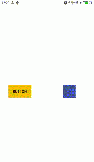
1,藍色的是一個自定義View,可跟随手指移動,作為Dependency View
2,黃色的是一個Button,作為child View
3,Behavior中定義的child view的依賴規則:Button随着View的移動在豎直方向同步移動,在水準方向相反。
布局檔案很簡單,根布局使用CoordinatorLayout,如下所示:
<?xml version="1.0" encoding="utf-8"?>
<android.support.design.widget.CoordinatorLayout
    xmlns:android="http://schemas.android.com/apk/res/android"
    xmlns:app="http://schemas.android.com/apk/res-auto"
    android:layout_width="match_parent"
    android:layout_height="match_parent">

    <Button
        android:layout_width="wrap_content"
        android:layout_height="wrap_content"
        android:background="@color/colorPrimary"
        app:layout_behavior="cn.xuexuan.newui.CoordinatorBehavior"/>

    <cn.xuexuan.newui.MoveView
        android:layout_width="50dp"
        android:layout_height="50dp"
        android:background="@color/colorAccent"
        />

</android.support.design.widget.CoordinatorLayout>
重點就是這個自定義Behavior的實作,要實作自定義的behavior類,我們需要繼承CoordinatorLayout.Behavior < T>,其中泛型參數T是我們要執行動作的View類,也就是Child,注意必須加入一個MyBehavior的構造器,帶有Context和AttributeSet參數,然後就是去實作Behavior的兩個方法,該自定義Behavior的代碼如下:
public class MyBehavior extends CoordinatorLayout.Behavior<Button> {

    private int width;

    public MyBehavior(Context context, AttributeSet attrs) {
        super(context, attrs);
        DisplayMetrics display = context.getResources().getDisplayMetrics();
        width = display.widthPixels;
    }

    /**
    * 判斷child的布局是否依賴dependency
    * 根據邏輯判斷rs的取值,傳回false表示child不依賴dependency,ture表示依賴
    */
    @Override
    public boolean layoutDependsOn(CoordinatorLayout parent, Button child, View dependency) {
        //如果dependency是TempView的執行個體,說明它就是我們所需要的Dependency
        return dependency instanceof TempView;
    }

    /**
    * 每次dependency位置發生變化,都會執行onDependentViewChanged方法
    * 傳回true表示child的位置或者是寬高也要發生改變,否則就傳回false
    */
    @Override
    public boolean onDependentViewChanged(CoordinatorLayout parent, Button btn, View dependency) {
        //根據dependency的位置,設定Button的位置
        int top = dependency.getTop();
        int left = dependency.getLeft();
        int x = width - left - btn.getWidth();
        int y = top;
        setPosition(btn, x, y);
        return true;
    }

    private void setPosition(View v, int x, int y) {
        CoordinatorLayout.MarginLayoutParams layoutParams = (CoordinatorLayout.MarginLayoutParams) v.getLayoutParams();
        layoutParams.leftMargin = x;
        layoutParams.topMargin = y;
        v.setLayoutParams(layoutParams);
    }
}
OK,現在我們定義好了跟随Dependency一直變化的動作(Behavior),接下來我們就要指定哪個View來執行這些操作。方法很簡單,直接在布局檔案中通過app:layout_behavior屬性指定就好了。
2,AppbarLayout
AppBarLayout 是繼承LinerLayout實作的一個ViewGroup容器元件,它是為了Material Design設計的AppBar,支援手勢滑動操作。預設的AppBarLayout是垂直方向的,它裡面可以包含多個子View,它的作用是把AppBarLayout包裹的所有内容都作為AppBar來顯示。
他的最主要特點是滑動,AppbarLayout要實作酷炫的滑動效果必須依賴于CoordinatorLayout使用,作為CoordinatorLayout的直接子view,如果父view是其他的viewGroup那麼是沒有效果的。
它可以讓你定制,當指定的某個可滾動的View發生滾動時,AppBarLayout内部的某個子View實作何種動作。
這裡說的某個可滾動的View就是NestedScrollView或者實作了NestedScrollView機制的其它控件, 如RecyclerView,使用ListView或者ScrollView是沒有效果的,它有一個布局行為Layout_Behavior:
這個behavior是系統AppBarLayout幫我們定義好了的,我們直接拿來用即可。
而AppbarLayout中指定的子View要實作何種動作,是通過在布局中加app:layout_scrollFlags屬性來指定的,layout_scrollFlags有如下5種選項:
1,scroll: 所有想滾動出螢幕的view都需要設定這個flag- 沒有設定這個flag的view将被固定在螢幕頂部。
2,enterAlways: 這個flag讓任意向下的滾動都會導緻該view變為可見,啟用快速“傳回模式”。
3,enterAlwaysCollapsed: 當你的視圖已經設定minHeight屬性又使用此标志時,你的視圖隻能以最小高度進入,隻有當滾動視圖到達頂部時才擴大到完整高度。
4,exitUntilCollapsed: 當視圖會在滾動時,它一直滾動到設定的minHeight時完全隐藏。
5,snap:在滾動結束後,如果view隻是部分可見,它将滑動到最近的邊界。比如,如果view的底部隻有25%可見,它将滾動離開螢幕,而如果底部有75%可見,它将滾動到完全顯示,類似于我們側拉菜單的一個回彈效果,這個效果是可以和其他幾個效果一起使用的。
3和4兩種模式基本隻有在CollapsingToolbarLayout才有用,關于CollapsingToolbarLayout的使用下一節我們會将,而前面兩種模式是需要一起使用的。
綜上所述,我們如果要實作AppbarLayout的滑動效果,必須滿足如下條件:
1,結合協調布局一起使用,并作為協調布局的直接子View。
2,下方必須有可支援滾動的View,這裡說的可滾動View指的是NestedScrollView或者實作了NestedScrollView機制的其它控件, 如RecyclerView,ViewPager等,scrollview和ListView不可以,并且為該可滾動View添加app:layout_behavior="@string/appbar_scrolling_view_behavior" 屬性。
3,為AppbarLayout的某個需要滾動的子View設定app:layout_scrollFlags屬性,并設定不同的屬性值來指定需要響應的動作。
下面我們來看一個布局檔案的例子:
<?xml version="1.0" encoding="utf-8"?>
<android.support.design.widget.CoordinatorLayout xmlns:android="http://schemas.android.com/apk/res/android"
    xmlns:app="http://schemas.android.com/apk/res-auto"
    android:id="@+id/id_coordinatorlayout"
    android:layout_width="match_parent"
    android:layout_height="match_parent"
    android:fitsSystemWindows="true">

    <android.support.design.widget.AppBarLayout
        android:id="@+id/id_appbarlayout"
        android:layout_width="match_parent"
        android:layout_height="wrap_content">

        <!--
        屬性解析:
            app:theme:指定Toolbar的樣式,包括ActionbarToggle和popupMenu的訓示圖示顔色
            app:popupTheme:指定popupMenu溢出後的樣式
            app:title:    指定Toolbar中主Title的内容
        -->
        <android.support.v7.widget.Toolbar
            android:id="@+id/id_toolbar"
            android:layout_width="match_parent"
            android:layout_height="?attr/actionBarSize"
            android:background="?attr/colorPrimary"
            app:layout_scrollFlags="scroll|enterAlways"
            app:popupTheme="@style/ThemeOverlay.AppCompat.Light"
            app:theme="@style/ThemeOverlay.AppCompat.ActionBar"
            app:title="@string/toolbar_title" />

        <android.support.design.widget.TabLayout
            android:id="@+id/id_tablayout"
            android:layout_width="match_parent"
            android:layout_height="wrap_content"
            app:tabGravity="fill"
            app:tabIndicatorColor="@color/main_white" />

    </android.support.design.widget.AppBarLayout>

    <!--
        我們常用的ViewPager,不多說了。你會發現多了一個 app:layout_behavior 屬性,沒錯,
            如果你使用CoordinatorLayout來實作Toolbar滾動漸變消失動畫效果,那就必須在它下面的那個控件中加入這個屬性,
            并且下面的這個控件必須是可滾動的。
        當設定了layout_behavior的控件滑動時,就會觸發設定了layout_scrollFlags的控件發生狀态的改變。
    -->
    <android.support.v4.view.ViewPager
        android:id="@+id/id_viewpager"
        android:layout_width="match_parent"
        android:layout_height="wrap_content"
        app:layout_behavior="@string/appbar_scrolling_view_behavior" />

</android.support.design.widget.CoordinatorLayout>
上面的布局檔案中,AppBarLayout中包含了兩個子View:ToolBar和TabLayout,而我們隻是設定了ToolBar可以滾動,這樣在界面向上滾動時,ToolBar會隐藏,此時TabLayout會占據原本Toolbar的位置。
注意兩種取值的差別:
1,scroll|enterAlways:當界面向上滾動時,AppBarLayout先滾動到ToolBar完全隐藏,然後滾動視圖才開始向上滾動,界面向下滾動時也是一樣,AppBarLayout先滾動到ToolBar完全顯示,然後滾動視圖才開始向下滾動。
2,scroll:去掉enterAlways會發現,當界面向上滾動時還是AppBarLayout先滾動到ToolBar完全隐藏,然後滾動視圖才開始向上滾動,但是此時當界面向下滾動時,就不是AppBarLayout先滾動了,而是滾動視圖先向下滾動到頂部,然後AppBarLayout才開始向下滾動直到ToolBar完全顯示出來。
注意:enterAlways依賴于scroll,是以enterAlways必須與scroll搭配使用,單獨使用是沒有效果的。
以上兩種取值不管是scroll|enterAlways還是scroll,都存在這種情況,就是當我們停止滾動時,ToolBar很可能隻是部分可見,即一半顯示一半隐藏的狀态,為了避免這個問題我們可以結合snap一起使用,上面也說了snap會有一個回彈效果,根據我們滾動停在的ToolBar的位置來選擇使ToolBar完全顯示或者全完隐藏,即同時設定:scroll|enterAlways|snap或者scroll|snap。
案例:CoordinatorLayout+AppBarLayout實作TabLayout頂部懸浮效果
<?xml version="1.0" encoding="utf-8"?>
<android.support.design.widget.CoordinatorLayout xmlns:android="http://schemas.android.com/apk/res/android"
    xmlns:app="http://schemas.android.com/apk/res-auto"
    xmlns:tools="http://schemas.android.com/tools"
    android:id="@+id/activity_toolbar"
    android:layout_width="match_parent"
    android:layout_height="match_parent"
    android:orientation="vertical"
    tools:context="com.gpf.mvp.ui.activity.ToolbarActivity">

    <android.support.design.widget.AppBarLayout
        android:layout_width="match_parent"
        android:layout_height="wrap_content">

        <LinearLayout
            app:layout_scrollFlags="scroll|enterAlways|snap"
            android:layout_width="match_parent"
            android:layout_height="wrap_content"
            android:orientation="vertical">
            <ImageView
                android:layout_width="match_parent"
                android:layout_height="140dp"
                android:background="@mipmap/ic_launcher"/>
            <TextView
                android:layout_width="match_parent"
                android:layout_height="wrap_content"
                android:text="我是圖檔描述"/>
        </LinearLayout>

        <android.support.design.widget.TabLayout
            android:layout_width="match_parent"
            android:layout_height="wrap_content">

        </android.support.design.widget.TabLayout>

    </android.support.design.widget.AppBarLayout>

    <android.support.v4.view.ViewPager
        android:layout_width="match_parent"
        android:layout_height="match_parent"
        app:layout_behavior="@string/appbar_scrolling_view_behavior">

    </android.support.v4.view.ViewPager>

</android.support.design.widget.CoordinatorLayout>
3,CollapsingToolbarLayout
CollapsingToolbarLayout是用來實作一個可以折疊的Toolbar,它繼承自FrameLayout,可以讓toolbar拉伸打開時顯示的内容多樣化,設定例如imageview,textview,button之類的使内容更豐富,作為AppbarLayout的直接子View使用。
1,通常作為AppBarLayout子View使用,是以可以給它設定layout_scrollFlags。
2,在CollapsingToolbarLayout的子View中可以設定以下屬性:
layout_collapseMode (折疊模式) - 有兩個值:
pin - 設定為這個模式時,當CollapsingToolbarLayout完全收縮後,Toolbar還可以保留在螢幕上。
parallax - 設定為這個模式時,在内容滾動時,CollapsingToolbarLayout中的View(比如ImageView)也可以同時滾動,實作視差滾動效果,和layout_collapseParallaxMultiplier搭配使用。
layout_collapseParallaxMultiplier(視差因子) - 設定視差滾動因子,值為:0~1。
之前在講AppBarLayout的子View的layout_scrollFlags屬性的時候,說道其中兩個屬性是配合CollapsingToolbarLayout來使用的,他們分别是:
enterAlwaysCollapsed: 當你的視圖已經設定minHeight屬性又使用此标志時,你的視圖隻能以最小高度進入,隻有當滾動視圖到達頂部時才擴大到完整高度。
exitUntilCollapsed: 當視圖會在滾動時,它一直滾動到設定的minHeight時完全隐藏。
scroll|exitUntilCollapsed(必須一起使用):當界面在向上滾動時,AppBarLayout的子View先向上滾動直到最小高度,此時滾動視圖才開始向上滾動,當界面向下滾動時,滾動視圖先向下滾動到頂部,然後AppBarLayout的子View才開始從最小高度向下滾動直到完全顯示。
scroll|enterAlways|enterAlwaysCollapsed(必須一起使用):界面在向上滾動時,AppBarLayout的子View先向上滾動直到完全隐藏,然後滾動視圖才開始向上滾動,此時,界面向下滾動,AppBarLayout的子View先向下滾動到顯示出最小高度,然後滾動視圖開始向下滾動,當滾動視圖向下滾動到頂部時,此時AppBarLayout的子View再繼續向下滾動直到達到最大高度完全顯示為止。
toolbar的預設最小高度minHeight就是"?attr/actionBarSize" , 很多時候我們可以不用設定。
我們來看以下布局:
<?xml version="1.0" encoding="utf-8"?>
<android.support.design.widget.CoordinatorLayout
    ...>

    <android.support.design.widget.AppBarLayout
        android:layout_width="match_parent"
        android:layout_height="150dp">

        <android.support.design.widget.CollapsingToolbarLayout
            android:id="@+id/collapsing_toolbar_layout"
            android:layout_width="match_parent"
            android:layout_height="match_parent"
            android:theme="@style/ThemeOverlay.AppCompat.Dark.ActionBar"
            app:layout_scrollFlags="scroll|exitUntilCollapsed">

            <android.support.v7.widget.Toolbar
                android:id="@+id/toolbar"
                android:layout_width="match_parent"
                android:layout_height="?attr/actionBarSize"
                android:background="?attr/colorPrimary"
                app:layout_collapseMode="parallax"
                app:popupTheme="@style/ThemeOverlay.AppCompat.Light"
                app:title="Title" />
        </android.support.design.widget.CollapsingToolbarLayout>

    </android.support.design.widget.AppBarLayout>

    <android.support.v4.widget.NestedScrollView
        android:layout_width="match_parent"
        android:layout_height="match_parent"
        app:layout_behavior="@string/appbar_scrolling_view_behavior">

        <TextView
            android:id="@+id/tv_content"
            android:layout_width="match_parent"
            android:layout_height="match_parent"
            android:layout_margin="16dp"
            android:lineSpacingMultiplier="2"
            android:text="@string/textContent" />
    </android.support.v4.widget.NestedScrollView>

</android.support.design.widget.CoordinatorLayout>
我們設定了CollapsingToolbarLayout的app:layout_scrollFlags=“scroll|exitUntilCollapsed” ,也就是說我們設定的150dp高的AppBarLayout在向上活動的過程中,子View也就是CollapsingToolbarLayout會先向上滑動,直到達到ToolBar預設的最小高度時會停止滑動,相應的我們在ToolBar中設定了app:layout_collapseMode=“parallax”,此時ToolBar不會留在螢幕上,是以最終的效果如下圖:

我們會發現,因為折疊模式的問題, toolbar的頂部圖示沒了, 我們改下折疊模式:app:layout_collapseMode=“pin”,再來看下效果:
接着我們再将app:layout_scrollFlags的值改為scroll|enterAlways|enterAlwaysCollapsed,從上面我們知道這樣的屬性組合,會使AppBarLayout在上滑時滾出螢幕,下滑時先到最小高度,然後滾動視圖下滑,最後又是AppBarLayout繼續下滑達到最大高度,效果如下:
上面我們在CollapsingToolbarLayout中隻是添加了一個ToolBar,接下來我們在其中在添加一個ImageView,添加之後的布局如下:
<?xml version="1.0" encoding="utf-8"?>
<android.support.design.widget.CoordinatorLayout
    ...>
    <android.support.design.widget.AppBarLayout
        android:layout_width="match_parent"
        android:layout_height="200dp">
        <android.support.design.widget.CollapsingToolbarLayout
            ...
            android:theme="@style/ThemeOverlay.AppCompat.Dark.ActionBar"
            app:layout_scrollFlags="scroll|enterAlways|enterAlwaysCollapsed">
            <ImageView
                android:layout_width="match_parent"
                android:layout_height="match_parent"
                android:scaleType="centerCrop"
                android:src="@drawable/darkbg"
                app:layout_collapseMode="parallax"
                app:layout_collapseParallaxMultiplier="0.7"/>
            <android.support.v7.widget.Toolbar
                android:id="@+id/toolbar"
                android:layout_width="match_parent"
                android:layout_height="?attr/actionBarSize"
                android:background="?attr/colorPrimary"
                app:layout_collapseMode="pin"
                app:popupTheme="@style/ThemeOverlay.AppCompat.Light"
                app:title="Title" />
        </android.support.design.widget.CollapsingToolbarLayout>
    </android.support.design.widget.AppBarLayout>

    <android.support.v4.widget.NestedScrollView
        ...
        app:layout_behavior="@string/appbar_scrolling_view_behavior">
        <TextView
            ... />
    </android.support.v4.widget.NestedScrollView>

</android.support.design.widget.CoordinatorLayout>
可以看到在上面我們設定了AppBarLayout的高度為200dp,CollapsingToolbarLayout的app:layout_scrollFlags=“scroll|enterAlways|enterAlwaysCollapsed”,ImageView的折疊模式為parallax,ToolBar的折疊模式為pin,最終的效果如下:
折疊模式parallax可以用來實作視差滾動效果,通常和layout_collapseParallaxMultiplier(設定視差因子)搭配使用。
app:layout_collapseParallaxMultiplier="0.7"屬性:設定視差滾動因子,值的範圍是0~~1。
上面的ToolBar的背景和圖檔背景不搭,有點别扭,我們去掉ToolBar的背景看看效果:
接着我們給CollapsingToolbarLayout設定一下contentScrim屬性
<android.support.design.widget.CollapsingToolbarLayout
    ...
    app:contentScrim="?attr/colorPrimary"
    ...>
該屬性設定的是當CollapsingToolbarLayout完全折疊時的背景顔色。
效果如下:
如果不想TooBar滑出螢幕,我們可以更改CollapsingToolbarLayout的app:layout_scrollFlags=“scroll|exitUntilCollapsed”,此時效果如下:
我們暫時去掉contentScrim屬性,恢複CollapsingToolbarLayout的app:layout_scrollFlags="scroll|enterAlways|enterAlwaysCollapsed"的設定。
接下來,我們實作沉浸式設計,将狀态欄設定成透明的,隻需要在style主題中的AppTheme裡增加一條:
<style name="AppTheme" parent="Theme.AppCompat.Light.NoActionBar">
    ...
    <item name="android:statusBarColor">@android:color/transparent</item>
</style>
在布局裡面, 将ImageView和所有它上面的父View都添加fitsSystemWindows屬性:
<?xml version="1.0" encoding="utf-8"?>
<android.support.design.widget.CoordinatorLayout
    ...
    android:fitsSystemWindows="true">
    <android.support.design.widget.AppBarLayout
        ...
        android:fitsSystemWindows="true">
        <android.support.design.widget.CollapsingToolbarLayout
            ...
            android:fitsSystemWindows="true">
            <ImageView
                ...
                android:fitsSystemWindows="true" />
            <android.support.v7.widget.Toolbar
                ... />
        </android.support.design.widget.CollapsingToolbarLayout>
    </android.support.design.widget.AppBarLayout>


    <android.support.v4.widget.NestedScrollView
        ...>
        <TextView
            ... />
    </android.support.v4.widget.NestedScrollView>

</android.support.design.widget.CoordinatorLayout>
我們來看下效果:
我們還可以通過在CollapsingToolbarLayout裡設定statusBarScrim屬性為透明色,然後更改layout_scrollFlags為 "scroll|exitUntilCollapsed"達到狀态欄透明的效果,如下圖:
AppbarLayout整個做成沉浸式之後, 狀态欄的圖示可能會受到封面圖檔顔色過淺的影響, 可以給其加一個漸變的不透明層.
漸變遮罩設定方法:
在res/drawable檔案夾下建立一個名為status_gradient的xml資源檔案, 代碼如下:
<?xml version="1.0" encoding="utf-8"?>
<shape xmlns:android="http://schemas.android.com/apk/res/android">
    <gradient
        android:angle="270"
        android:endColor="@android:color/transparent"
        android:startColor="#CC000000" />
        <!-- shape節點中, 可以通過android:shape來設定形狀, 預設是矩形.
        gradient節點中angle的值270是從上到下,0是從左到右,90是從下到上。
        此處的效果就是從下向上, 顔色逐漸由純透明慢慢變成黑透色-->
</shape>
布局中, 在ImageView下面增加一個View, 背景設為上面的漸變遮罩:
<!-- 在頂部增加一個漸變遮罩, 防止出現status bar 狀态欄看不清 -->
<View
    android:layout_width="match_parent"
    android:layout_height="40dp"
    android:background="@drawable/status_gradient"
    app:layout_collapseMode="pin"
    android:fitsSystemWindows="true" />
給該遮罩層View設定折疊模式: app:layout_collapseMode=“pin” , 這樣折疊到頂部會定住。來看下效果:
添加FloatingActionButton:
我們在布局中加一個懸浮按鈕,讓它的錨點挂載Appbar的右下角. 這樣這個懸浮按鈕就和Appbar關聯起來了:
<android.support.design.widget.CoordinatorLayout
    ...>

    <android.support.design.widget.AppBarLayout
        ...
    </android.support.design.widget.AppBarLayout>

    <android.support.v4.widget.NestedScrollView
    ...
    </android.support.v4.widget.NestedScrollView>

    <android.support.design.widget.FloatingActionButton
        android:id="@+id/fab"
        android:layout_width="wrap_content"
        android:layout_height="wrap_content"
        android:layout_margin="16dp"
        android:src="@drawable/ic_share_white_24dp"
        android:elevation="4dp"
        app:pressedTranslationZ="16dp"
        app:rippleColor="@android:color/white"
        app:layout_anchor="@id/appbar"
        app:layout_anchorGravity="bottom|end"/>

</android.support.design.widget.CoordinatorLayout>
我們來看下效果:
最後附上一個Activity代碼供參考:
public class CollapsingToolbarLayoutActivity extends AppCompatActivity {
@Override
protected void onCreate(@Nullable Bundle savedInstanceState) {
    super.onCreate(savedInstanceState);
    setContentView(R.layout.activity_ctl);

    Toolbar toolbar = (Toolbar) findViewById(R.id.ctl_toolbar);
    setSupportActionBar(toolbar);
    getSupportActionBar().setDisplayHomeAsUpEnabled(true);
    toolbar.setNavigationIcon(getResources().getDrawable(R.drawable.back));
    toolbar.setNavigationOnClickListener(new View.OnClickListener() {
        @Override
        public void onClick(View view) {
            finish();
        }
    });

    CollapsingToolbarLayout collapsing_toolbar_layout = (CollapsingToolbarLayout) findViewById(R.id.collapsing_toolbar_layout);
    collapsing_toolbar_layout.setTitle(getResources().getString(R.string.app_name));
    //設定展開的時候标題顯示字型顔色
    collapsing_toolbar_layout.setExpandedTitleColor(Color.WHITE);
    //設定折疊的時候标題顯示字型顔色
    collapsing_toolbar_layout.setCollapsedTitleTextColor(Color.WHITE);
    //設定折疊時候标題對齊位置
    collapsing_toolbar_layout.setCollapsedTitleGravity(Gravity.LEFT);
    findViewById(R.id.ctl_fab).setOnClickListener(new View.OnClickListener() {
        @Override
        public void onClick(View view) {
            Snackbar.make(view, "點選的是FAB", Snackbar.LENGTH_SHORT).show();
        }
    });
}

public static void start(Context mContext) {
    mContext.startActivity(new Intent(mContext, CollapsingToolbarLayoutActivity.class));
}
}