.Net Framework 4.5和.Net Core開始提供類似Office界面風格的控件。沒事想抄個Windows自帶的畫圖玩玩,Ribbon視窗往一套,倒也簡單,隻是細節方面有些不同,最明顯的就是主菜單部分,畫圖裡是扁平的形狀,并且内容是用的文本。然而RibbonApplicationMenu去沒有提供這樣的選項,隻能使用圖檔,而且沒有地方可以設定。如果想做得跟畫圖一樣,那就要定制這個菜單了。好在Xaml的機制下可以比較靈活地修改内容模闆。以下就說說修改的過程。
定制WPF控件有兩種方法,一種是通過繼承,另一種是就是建立内容模闆。前一種一般是要增加控件的新功能,後一種隻是為了修改顯式樣式。這裡隻是為了修改顯示樣式,是以選擇後一種就行了。
開始之前,先了解一下Ribbon視窗的結構。
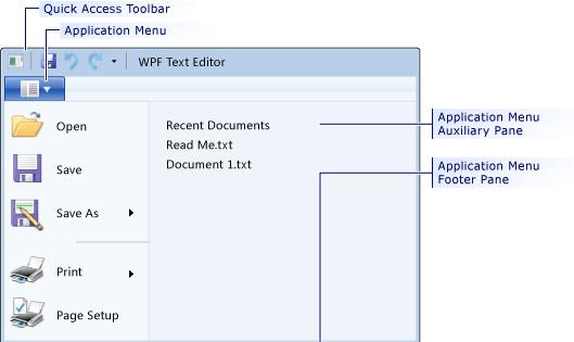
從圖中可以看出,這是一個複合控件。如果是簡單控件,直接重給控件内容就行了,比如自定義一個圓形按鈕,
<ControlTemplate x:Key="roundbutton" TargetType="Button">
    <Grid>
        <Ellipse x:Name="backgroundElement" Fill="{TemplateBinding Background}" Stroke="{TemplateBinding Foreground}" />
        <ContentPresenter HorizontalAlignment="Center" VerticalAlignment="Center" />
    </Grid>
</ControlTemplate>
但如果重繪一個複合控件,隻是這麼簡單的繪制的話,會發現控件不可用了,比如一個ComboBox控件,它實際上包含一個Textbox、一個ToggleButton、一個彈出視窗以及菜單項的模闆。這些子控件稱為Parts,每個part有一個名稱,在呈現控件樹的時候使用。
ComboBox 有兩個part
PART_EditableTextBox ComboBox的文本内容.
PART_Popup Popup 下拉彈出視窗.
同樣,RibbonApplicationMenu也有5個part,分别是
PART_PopupToggleButton 預設按扭,類型為RibbonToggleButton
PART_Popup 下拉框,類型為Popup
PART_SubmenuPlaceholder 子菜單容器,類型為一個容器,比如StackPanel
PART_FooterPaneContentPresenter 底部内容,類型為ContentPresenter
PART_AuxiliaryPaneContentPresenter 右側内容,類型為ContentPresenter
我們定義這個按鈕:
<RibbonToggleButton x:Name="PART_ToggleButton" ClickMode="Release" Label="檔案" IsChecked="{Binding IsDropDownOpen, Mode=TwoWay, RelativeSource={RelativeSource TemplatedParent}}" Foreground="White" Background="#FF3E3EC7" Focusable="False" IsTabStop="False" FocusedBackground="#FF6161F7" CornerRadius="0,0,0,0" MouseOverBackground="#FF6161F7" MouseOverBorderBrush="#FF6161F7"/>
這裡需要注意的兩個屬性,一個是ClickMode,要設定成Release,否則因為綁定的原因不能正常觸發,将CornerRadius設定成"0,0,0,0",預設是“2,2,2,2”。
有了按鈕後,還隻能觸發IsDropDownOpen屬性的變化,接下來就要根據這個屬性來觸發彈框了。我們要定義一個Popup.
<Popup x:Name="PART_Popup" IsOpen="{TemplateBinding IsDropDownOpen}" PopupAnimation="Slide" Placement="Relative">
</Popup>
有了這個Popup,點選藍色的按鈕就看一個彈出的小框框。接下來完善一下其它部分的内容:
<Popup x:Name="PART_Popup" IsOpen="{TemplateBinding IsDropDownOpen}" PopupAnimation="Slide" Placement="Relative" Width="450">
                                    <Border Background="#FFE6E6E6" BorderBrush="#FF5EADCB" BorderThickness="1,1,1,1">
                                        <Grid MinWidth="{TemplateBinding ActualWidth}" MaxHeight="{TemplateBinding MaxHeight}">
                                            <Grid.RowDefinitions>
                                                <RowDefinition/>
                                                <RowDefinition/>
                                                <RowDefinition/>
                                            </Grid.RowDefinitions>
                                            <Grid.ColumnDefinitions>
                                                <ColumnDefinition/>
                                                <ColumnDefinition/>
                                            </Grid.ColumnDefinitions>
                                            <Border Grid.Row="1" Width="150">
                                                <StackPanel  IsItemsHost="True"/>
                                            </Border>
                                            <Border Grid.Row="1" Grid.Column="1" BorderBrush="Gray" Width="150">
                                                <ContentPresenter x:Name="PART_AuxiliaryPaneContentPresenter"  ContentTemplateSelector="{TemplateBinding AuxiliaryPaneContentTemplateSelector}" Content="{TemplateBinding AuxiliaryPaneContent}" ContentTemplate="{TemplateBinding AuxiliaryPaneContentTemplate}"/>
                                            </Border>
                                            <Border Grid.Row="2" Grid.ColumnSpan="2" Height="30">
                                                <ContentPresenter x:Name="PART_FooterPaneContentPresenter"  Content="{TemplateBinding FooterPaneContent}" ContentTemplate="{TemplateBinding FooterPaneContentTemplate}" ContentTemplateSelector="{TemplateBinding FooterPaneContentTemplateSelector}"/>
                                            </Border>
                                            <RibbonToggleButton x:Name="PART_PopupToggleButton" ClickMode="Release" Label="檔案" IsChecked="{Binding IsDropDownOpen, Mode=TwoWay, RelativeSource={RelativeSource TemplatedParent}}" Foreground="White" Background="#FF3E3EC7" Focusable="False" IsTabStop="False" IsHitTestVisible="True" HorizontalAlignment="Left" VerticalAlignment="Center" Height="{Binding ActualHeight, ElementName=PART_ToggleButton, Mode=OneWay}" Width="{Binding ActualWidth, ElementName=PART_ToggleButton, Mode=OneWay}" FocusedBackground="#FF6161F7" CornerRadius="0,0,0,0" MouseOverBackground="#FF6161F7" MouseOverBorderBrush="#FF6161F7" />

                                        </Grid>
                                    </Border>
                                </Popup>
這個代碼中多了一個RibbonToggleButton,畫圖程式菜單裡有這麼一個按鈕,這個也是RibbonApplicationMenu的一個Part,實際是繼承了RibbonMenuButton的内容,畫圖裡将這個按鈕顯示在了最上方,如果沒這個按鈕,主菜單按鈕會被擋在下邊,為了保持外觀的一至性,在彈出框再放一個相同的按鈕。同樣的,Windows資料總管也是相同的設計。
整個模闆的實作代碼如下:
<ControlTemplate TargetType="RibbonApplicationMenu">
                            <Grid>
                                <Popup x:Name="PART_Popup" IsOpen="{TemplateBinding IsDropDownOpen}" PopupAnimation="Slide" Placement="Relative" Width="450">
                                    <Border Background="#FFE6E6E6" BorderBrush="#FF5EADCB" BorderThickness="1,1,1,1">
                                        <Grid MinWidth="{TemplateBinding ActualWidth}" MaxHeight="{TemplateBinding MaxHeight}">
                                            <Grid.RowDefinitions>
                                                <RowDefinition/>
                                                <RowDefinition/>
                                                <RowDefinition/>
                                            </Grid.RowDefinitions>
                                            <Grid.ColumnDefinitions>
                                                <ColumnDefinition/>
                                                <ColumnDefinition/>
                                            </Grid.ColumnDefinitions>
                                            <Border Grid.Row="1" Width="150">
                                                <StackPanel  IsItemsHost="True"/>
                                            </Border>
                                            <Border Grid.Row="1" Grid.Column="1" BorderBrush="Gray" Width="150">
                                                <ContentPresenter x:Name="PART_AuxiliaryPaneContentPresenter"  ContentTemplateSelector="{TemplateBinding AuxiliaryPaneContentTemplateSelector}" Content="{TemplateBinding AuxiliaryPaneContent}" ContentTemplate="{TemplateBinding AuxiliaryPaneContentTemplate}"/>
                                            </Border>
                                            <Border Grid.Row="2" Grid.ColumnSpan="2" Height="30">
                                                <ContentPresenter x:Name="PART_FooterPaneContentPresenter"  Content="{TemplateBinding FooterPaneContent}" ContentTemplate="{TemplateBinding FooterPaneContentTemplate}" ContentTemplateSelector="{TemplateBinding FooterPaneContentTemplateSelector}"/>
                                            </Border>
                                            <RibbonToggleButton x:Name="PART_PopupToggleButton" ClickMode="Release" Label="檔案" IsChecked="{Binding IsDropDownOpen, Mode=TwoWay, RelativeSource={RelativeSource TemplatedParent}}" Foreground="White" Background="#FF3E3EC7" Focusable="False" IsTabStop="False" IsHitTestVisible="True" HorizontalAlignment="Left" VerticalAlignment="Center" Height="{Binding ActualHeight, ElementName=PART_ToggleButton, Mode=OneWay}" Width="{Binding ActualWidth, ElementName=PART_ToggleButton, Mode=OneWay}" FocusedBackground="#FF6161F7" CornerRadius="0,0,0,0" MouseOverBackground="#FF6161F7" MouseOverBorderBrush="#FF6161F7" />

                                        </Grid>
                                    </Border>
                                </Popup>
                                <RibbonToggleButton x:Name="PART_ToggleButton" ClickMode="Release" Label="檔案" IsChecked="{Binding IsDropDownOpen, Mode=TwoWay, RelativeSource={RelativeSource TemplatedParent}}" Foreground="White" Background="#FF3E3EC7" Focusable="False" IsTabStop="False" FocusedBackground="#FF6161F7" CornerRadius="0,0,0,0" MouseOverBackground="#FF6161F7" MouseOverBorderBrush="#FF6161F7"/>


                            </Grid>

                        </ControlTemplate>
![.NET程式員的技能分析參考V1.0(有附件)[圖]](data:image/gif;base64,R0lGODlhAQABAIAAAP///wAAACwAAAAAAQABAAACAkQBADs=)