Material Design越來越流行了,然而從來沒有人整理一份比較好的MD 學習文檔,而自己也不怎麼熟悉,是以這篇文檔就誕生了。
聲明: 本文是參考郭神出版的《Android第二行代碼》第12章Material Design實戰編寫,在此基礎上做了一些取舍與提起。
轉載請标明出處:
http://blog.csdn.net/u014702332/article/details/53731511
本文出自:【掃地僧的部落格】
1. ToolBar
使用ToolBar需要注意以下幾點
1. 主題需要修改一下,需要繼承NoActionBar,而不要用DarkActionBar,這樣會導緻ActionBar重複,程式崩潰
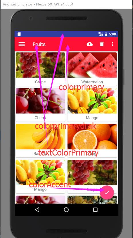
2. 顔色樣式 :
1. colorPrimary   指定标題欄背影色
     2. colorPrimaryDrak   指定狀态欄顔色
     3. textColorPrimary   指定标題文字顔色
     4. windowBackground   背景色
     5. navigationBarColor 指定狀态導覽列顔色
     6. colorAccent  比較特殊,指定浮動按鈕顔色


    <!--<style name="AppTheme" parent="Theme.AppCompat.Light.DarkActionBar"> -->
    <style name="AppTheme" parent="Theme.AppCompat.Light.NoActionBar">
        <!-- Customize your theme here. -->
        <item name="colorPrimary">@color/colorPrimary</item>
        <item name="colorPrimaryDark">@color/colorPrimaryDark</item>
        <item name="colorAccent">@color/colorAccent</item>
    </style>
3. 注意引用主題 theme popupTheme
<?xml version="1.0" encoding="utf-8"?>
<FrameLayout xmlns:android="http://schemas.android.com/apk/res/android"
    xmlns:app="http://schemas.android.com/apk/res-auto"
    android:layout_width="match_parent"
    android:layout_height="match_parent">


    <android.support.v7.widget.Toolbar
        android:id="@+id/toolbar"
        android:layout_width="match_parent"
        android:layout_height="?attr/actionBarSize"
        android:background="?attr/colorPrimary"
        app:popupTheme="@style/ThemeOverlay.AppCompat.Light"
        app:theme="@style/ThemeOverlay.AppCompat.Dark.ActionBar"
        />
</FrameLayout>
看起來非常單調,這個時候我要插入按鈕了。
4.插入菜單按鈕
<?xml version="1.0" encoding="utf-8"?>
<menu
    xmlns:android="http://schemas.android.com/apk/res/android"
    xmlns:app="http://schemas.android.com/apk/res-auto"
    >

    <item
        android:id="@+id/back_up"
        android:icon="@drawable/ic_backup"
        android:title="back up"
        app:showAsAction="always"
        />

    <item
        android:id="@+id/delete"
        android:icon="@drawable/ic_delete"
        android:title="delete"
        app:showAsAction="ifRoom"
        />

    <item
        android:id="@+id/settings"
        android:icon="@drawable/ic_settings"
        android:title="settings"
        app:showAsAction="never"
        />

</menu>
- always 表示永遠顯示,如果螢幕空間不夠則不顯示
- ifRoom 表示螢幕空間足夠的情況下顯示在ToolBar中,不夠就顯示在菜單中。
- never 則表示永遠顯示在菜單中。
- 注意 ToolBar中的action按鈕隻會顯示按鈕,菜單中的action按鈕,隻會顯示文字

5.菜單的點選事件
@Override
    public boolean onCreateOptionsMenu(Menu menu) {
        getMenuInflater().inflate(R.menu.toolbar,menu);
        return super.onCreateOptionsMenu(menu);
    }


    @Override
    public boolean onOptionsItemSelected(MenuItem item) {
        switch (item.getItemId()) {

            case R.id.back_up:
                Toast.makeText(this, "You clicked Backup", Toast.LENGTH_SHORT).show();
                break;
            case R.id.delete:
                Toast.makeText(this, "You clicked Delete", Toast.LENGTH_SHORT).show();
                break;
            case R.id.settings:
                Toast.makeText(this, "You clicked Settings", Toast.LENGTH_SHORT).show();
                break;
            default:
        }
        return true;
    }
當然ToolBar功能遠不止這些,我這裡隻是列出常用的功能。一般項目夠用。
2. 滑動菜單
2.1 DrawerLayout
用法:首先他是一個布局,在布局中允許放入2個直接子控件,第一個子控件是主螢幕顯示的内容,第二個子控件是滑動菜單中顯示的内容
<?xml version="1.0" encoding="utf-8"?>
<android.support.v4.widget.DrawerLayout xmlns:android="http://schemas.android.com/apk/res/android"
    xmlns:app="http://schemas.android.com/apk/res-auto"
    android:id="@+id/drawer_layout"
    android:layout_width="match_parent"
    android:layout_height="match_parent">


    <FrameLayout

        android:layout_width="match_parent"
        android:layout_height="match_parent">


        <android.support.v7.widget.Toolbar
            android:id="@+id/toolbar"
            android:layout_width="match_parent"
            android:layout_height="?attr/actionBarSize"
            android:background="?attr/colorPrimary"
            app:popupTheme="@style/ThemeOverlay.AppCompat.Light"
            app:theme="@style/ThemeOverlay.AppCompat.Dark.ActionBar" />
    </FrameLayout>


    <TextView
        android:id="@+id/tv_menu"
        android:layout_width="match_parent"
        android:layout_height="match_parent"
        android:layout_gravity="start"
        android:text="this is menu"
        android:textSize="30sp"
        android:background="#FFF"

        />
</android.support.v4.widget.DrawerLayout>
這裡需要指定下TextView的 android:layout_gravity=”start” 告訴滑動菜單是在螢幕左邊,還是右邊,left,表示在左邊,right在右邊,這裡我用start,會根據系統語言來從左往右。
但是這樣弄完還有一個缺陷,使用者可能不知道有這個側滑菜單,是以我們需要添加一個按鈕來告訴使用者,官方推薦是在導航欄加入一個按鈕。
drawerLayout = (DrawerLayout) findViewById(R.id.drawer_layout);
        ActionBar actionBar = getSupportActionBar();
        if (null != actionBar){
            actionBar.setDisplayHomeAsUpEnabled(true);
            actionBar.setHomeAsUpIndicator(R.drawable.ic_menu);
        }
    }

    @Override
    public boolean onCreateOptionsMenu(Menu menu) {
        getMenuInflater().inflate(R.menu.toolbar,menu);
        return super.onCreateOptionsMenu(menu);
    }


    @Override
    public boolean onOptionsItemSelected(MenuItem item) {
        switch (item.getItemId()) {

            case android.R.id.home:
                drawerLayout.openDrawer(GravityCompat.START);
                break;
2.2 NavigationView
但上面的菜單欄顯示與我們實際想要的效果還差很完,還好官方提供了Navigation控件,讓我們很好的把菜單欄處理一下,幾行代碼就可以內建。
<?xml version="1.0" encoding="utf-8"?>
<android.support.v4.widget.DrawerLayout xmlns:android="http://schemas.android.com/apk/res/android"
    xmlns:app="http://schemas.android.com/apk/res-auto"
    android:id="@+id/drawer_layout"
    android:layout_width="match_parent"
    android:layout_height="match_parent">


    <FrameLayout

        android:layout_width="match_parent"
        android:layout_height="match_parent">


        <android.support.v7.widget.Toolbar
            android:id="@+id/toolbar"
            android:layout_width="match_parent"
            android:layout_height="?attr/actionBarSize"
            android:background="?attr/colorPrimary"
            app:popupTheme="@style/ThemeOverlay.AppCompat.Light"
            app:theme="@style/ThemeOverlay.AppCompat.Dark.ActionBar" />
    </FrameLayout>

    <android.support.design.widget.NavigationView
        android:id="@+id/nav_view"
        android:layout_gravity ="start"
        android:layout_width="match_parent"
        android:layout_height="match_parent"
        app:menu="@menu/nav_menu"
        app:headerLayout="@layout/header_layout"

        />

</android.support.v4.widget.DrawerLayout>
官方提供了NavigationView控件,我們隻需要指定app:menu與app:headerLayout就可以設定菜單欄與頭部欄目。
nav_menu布局檔案如下:
<?xml version="1.0" encoding="utf-8"?>
<menu xmlns:android="http://schemas.android.com/apk/res/android">
    <group android:checkableBehavior="single">

        <item
            android:id="@+id/nav_call"
            android:icon="@drawable/nav_call"
            android:title="call" />
        <item
            android:id="@+id/nav_friends"
            android:icon="@drawable/nav_friends"
            android:title="friends" />
        <item
            android:id="@+id/nav_location"
            android:icon="@drawable/nav_location"
            android:title="location" />
        <item
            android:id="@+id/nav_mail"
            android:icon="@drawable/nav_mail"
            android:title="mail" />
        <item
            android:id="@+id/nav_task"
            android:icon="@drawable/nav_task"
            android:title="task" />


    </group>
</menu>
以及header_layout.xml布局如下:
<?xml version="1.0" encoding="utf-8"?>

<RelativeLayout xmlns:android="http://schemas.android.com/apk/res/android"
    android:layout_width="match_parent"
    android:layout_height="180dp"
    android:background="?attr/colorPrimary"
    android:padding="10dp">


    <de.hdodenhof.circleimageview.CircleImageView
        android:id="@+id/icon_image"
        android:layout_width="70dp"
        android:layout_height="70dp"
        android:layout_centerInParent="true"
        android:src="@drawable/nav_icon" />

    <TextView
        android:id="@+id/username"
        android:layout_width="wrap_content"
        android:layout_height="wrap_content"
        android:layout_alignParentBottom="true"
        android:text="[email protected]"
        android:textColor="#FFF"
        android:textSize="14sp" />

    <TextView
        android:id="@+id/mail"
        android:layout_width="wrap_content"
        android:layout_height="wrap_content"
        android:layout_above="@id/username"
        android:text="Tony Green"
        android:textColor="#FFF"
        android:textSize="14sp" />

</RelativeLayout>
3.懸浮按鈕和可互動提示
3.1 FloatingActionButton
這個按鈕感覺用處好像和普通按鈕沒有多大差別,不知道官方為什麼會弄這個這樣的按鈕,完全必要似的啊,但不管吧,也給大家看一下
這裡面布局檔案有一個屬性 android:elevation=”8dp” 指定高度值,高度值越大,投資範圍越大,感覺沒有什麼用似的。直接用預設的就夠了。
直接上代碼吧:
<FrameLayout

        android:layout_width="match_parent"
        android:layout_height="match_parent">


        <android.support.v7.widget.Toolbar
            android:id="@+id/toolbar"
            android:layout_width="match_parent"
            android:layout_height="?attr/actionBarSize"
            android:background="?attr/colorPrimary"
            app:popupTheme="@style/ThemeOverlay.AppCompat.Light"
            app:theme="@style/ThemeOverlay.AppCompat.Dark.ActionBar" />


        <android.support.design.widget.FloatingActionButton
           android:id="@+id/fab"
            android:layout_width="wrap_content"
            android:layout_height="wrap_content"
            android:layout_margin="16dp"
            android:src="@drawable/ic_done"
            android:layout_gravity="bottom|end"
            android:elevation="8dp"
            />


    </FrameLayout>


        final FloatingActionButton floatingActionButton = (FloatingActionButton) findViewById(R.id.fab);
        floatingActionButton.setOnClickListener(new View.OnClickListener() {
            @Override
            public void onClick(View view) {
                Toast.makeText(A12Activity.this, "Fab click", Toast.LENGTH_SHORT).show();
            }
        });
3.2 Snackbar
首先要明确的是SnackBar并不是Toast的替代器,他們兩者之間有不同的應用場景,Toast的作用是告訴使用者現在發生了什麼事件,但同時使用者隻能被動接收這個事情,而SnackBar除了有Toast顯示 的功能外,還可以在這基礎上做其它的操作,打比方,我删除了一條資料,用SnackBar可以撤銷這個操作。
具體用法如下,非常簡單:
Snackbar.make(view,"Data delete!",Snackbar.LENGTH_LONG)
                .setAction("撤銷",new View.OnClickListener() {
            @Override
            public void onClick(View view) {
                Snackbar.make(view,"撤銷了",Snackbar.LENGTH_LONG).show();
            }
        }).show();
感覺比Toast好看些,另外如果你需要在這基礎上作撤銷操作,可以setAction。 個人感覺這個setAction并無卵用。
另外我們這個時候發現,SnackBar彈出View把懸浮按鈕擋住了,效果不好看,好在Material Design給出了解決方案,這就是,CoordinatorLayout
3.3 CoordinatorLayout
CoordinatorLayout 可以說是一個加強版的FrameLayout,在普通情況下的作用和FrameLayout基本一緻,事實上CoordinatorLayout可以監聽其所有了控件的各種事件,然後自動幫助我們做出最為合理的響應。舉個簡單例子,彈出SnackBar提示将懸浮按鈕遮擋住了,如果我們讓CoordinatorLayout監聽到SnackBar的彈出事件,那麼它會自動将内部的FloatingActionButton身上偏移,進而確定不會被SnackBar遮擋.
直接用CoordinatorLayout來替換FrameLayout就好了:
...
    <android.support.design.widget.CoordinatorLayout

        android:layout_width="match_parent"
        android:layout_height="match_parent">


        <android.support.v7.widget.Toolbar
            android:id="@+id/toolbar"
            android:layout_width="match_parent"
            android:layout_height="?attr/actionBarSize"
            android:background="?attr/colorPrimary"
            app:popupTheme="@style/ThemeOverlay.AppCompat.Light"
            app:theme="@style/ThemeOverlay.AppCompat.Dark.ActionBar" />


        <android.support.design.widget.FloatingActionButton
           android:id="@+id/fab"
            android:layout_width="wrap_content"
            android:layout_height="wrap_content"
            android:layout_margin="16dp"
            android:src="@drawable/ic_done"
            android:layout_gravity="bottom|end"
            android:elevation="8dp"
            />


    </android.support.design.widget.CoordinatorLayout>
...
下面我寫了兩份基本相同的代碼SnackBar中傳入的第一個參數,做了改動,如果用drawerLayout,,他不是CoordinatorLayout的子控件,是以無法堅挺變化,這個時候懸浮按鈕還是會被擋住。
Snackbar.make(drawerLayout,"Data delete!",Snackbar.LENGTH_LONG)
                        .setAction("撤銷",new View.OnClickListener() {
                            @Override
                            public void onClick(View view) {
                                Snackbar.make(drawerLayout,"撤銷了",Snackbar.LENGTH_LONG).show();
                            }
                        }).show();

                Snackbar.make(view,"Data delete!",Snackbar.LENGTH_LONG)
                        .setAction("撤銷",new View.OnClickListener() {
                            @Override
                            public void onClick(View view) {
                                Snackbar.make(view,"撤銷了",Snackbar.LENGTH_LONG).show();
                            }
                        }).show();
4. 卡片式布局
4.1 CardView
CardView也是一個FrameLayout,隻是額外提供了圓角和陰影等效果。這裡沒有什麼好講的,貼代碼吧。
<?xml version="1.0" encoding="utf-8"?>

<android.support.v7.widget.CardView xmlns:android="http://schemas.android.com/apk/res/android"

    xmlns:app="http://schemas.android.com/apk/res-auto"

    android:orientation="vertical"

    android:layout_width="match_parent"

    android:layout_height="match_parent"

    app:cardCornerRadius="4dp"

    android:elevation="5dp"

    >

    <TextView

        android:id="@+id/tv_info"

        android:layout_width="match_parent"

        android:layout_height="wrap_content" />


</android.support.v7.widget.CardView>
app:cardCornerRadius屬性指定卡片圓角的弧度,數值越大,弧度越大,另外還可以通過app:elevation屬性來指定卡片的高度,高度數值越大,投影ailfbn越大,但是投影效果越淡,高度值越小,投影範圍也越小,但是投影效果越濃。
4.2 AppBarLayout
上面會造成RecyclerView把ToolBar擋住,由于RecyclerView和ToolBar都是放在CoordinatorLayout中的,我們知道CoordinatorLayout就是一個加強版的FrameLayout,在不進行明确定位的情況下,預設都會放在左上角,進而産生遮擋。由于我們使用的是CoodinatorLayout,而不是FrameLayout是以我們有更加巧妙的解決辦法。
好在官方也給出方案使用AppBarLayout,它實際上是一個垂直方向的LinearLayout,它在内部做了很多滾動事件的封裝,并應用了Material Design設計理念
我們現在來解決之前覆寫的問題
- 将ToolBar嵌套到AppBarLayout中,
- 給RecyclerView指定一個布局行為, app:layout_behavior=”@string/appbar_scrolling_view_behavior”。
- 但這還沒有完,還需要在ToolBar中添加一個屬性 app:layout_scrollFlags=”scroll|enterAlways|snap”
- scroll 表示當RecyclerView身上滾動的時候,ToolBar會跟着向上滾動并實作隐藏
- enterAlways 表示當RecyclerView向下滾動的時候,ToolBar會跟着一起向下滾動,并重新顯示
- snap表示當ToolBar還沒有完全隐藏或者顯示的時候,會根據目前滾動的距離,自動選擇隐藏還是顯示
代碼如下:
<android.support.design.widget.CoordinatorLayout

        android:layout_width="match_parent"

        android:layout_height="match_parent">


        <android.support.design.widget.AppBarLayout

            android:layout_width="match_parent"

            android:layout_height="wrap_content">


            <android.support.v7.widget.Toolbar

                android:id="@+id/toolbar"

                android:layout_width="match_parent"

                android:layout_height="?attr/actionBarSize"

                android:background="?attr/colorPrimary"

                android:theme="@style/ThemeOverlay.AppCompat.Dark.ActionBar"

                app:popupTheme="@style/ThemeOverlay.AppCompat.Light"

                app:layout_scrollFlags="scroll|enterAlways|snap" />

        </android.support.design.widget.AppBarLayout>

        <android.support.v7.widget.RecyclerView
            android:id="@+id/recycler_view"
            android:layout_width="match_parent"
            android:layout_height="match_parent"
            app:layout_behavior="@string/appbar_scrolling_view_behavior"
            />
            ...
5 下拉重新整理
這個控件算是我們比較常用的控件了,但這裡我是需要再做一下說明
<android.support.design.widget.AppBarLayout
            android:layout_width="match_parent"
            android:layout_height="wrap_content">

            <android.support.v7.widget.Toolbar
                android:id="@+id/toolbar"
                android:layout_width="match_parent"
                android:layout_height="?attr/actionBarSize"
                android:background="?attr/colorPrimary"
                android:theme="@style/ThemeOverlay.AppCompat.Dark.ActionBar"
                app:popupTheme="@style/ThemeOverlay.AppCompat.Light"
                app:layout_scrollFlags="scroll|enterAlways|snap" />
        </android.support.design.widget.AppBarLayout>

        <android.support.v4.widget.SwipeRefreshLayout
            android:id="@+id/swipe_refresh"
            android:layout_width="match_parent"
            android:layout_height="match_parent"
            app:layout_behavior="@string/appbar_scrolling_view_behavior">

            <android.support.v7.widget.RecyclerView
                android:id="@+id/recycler_view"
                android:layout_width="match_parent"
                android:layout_height="match_parent" />
        </android.support.v4.widget.SwipeRefreshLayout>
這裡需要注意一下由于RecyclerView變成了SwipeRefreshLayout的子控件了,是以之前使用的app:layout_behavior 聲明布局行為也要清單SwipeRefreshLayout中才行
這裡我需要說明幾個SwipeRefreshLayout所用到的方法
- setColorSchemeResources(R.color.colorPrimary); 來設定下拉重新整理的顔色
- setOnRefreshListener 來做下拉重新整理監聽。
- 最後需要設定setRefreshing(false) 來結束重新整理事件,并隐藏重新整理進度條。
代碼如下:
private SwipeRefreshLayout swipeRefresh;
        swipeRefresh = (SwipeRefreshLayout) findViewById(R.id.swipe_refresh);
        swipeRefresh.setColorSchemeResources(R.color.colorPrimary);
        swipeRefresh.setOnRefreshListener(new SwipeRefreshLayout.OnRefreshListener() {
            @Override
            public void onRefresh() {
                refreshFruits();
            }
        });
    }

    private void refreshFruits() {
        new Thread(new Runnable() {
            @Override
            public void run() {
                try {
                    Thread.sleep();
                } catch (InterruptedException e) {
                    e.printStackTrace();
                }
                runOnUiThread(new Runnable() {
                    @Override
                    public void run() {
                        initFruits();
                        adapter.notifyDataSetChanged();
                        swipeRefresh.setRefreshing(false);
                    }
                });
            }
        }).start();
    }
6 可折疊式标題欄
6.1 CollapsingToolBarLaout
- 顧名思義 CollapsingToolBarLayout是一個作用于ToolBar基礎之上的布局,他不能獨立存在的,
- 它在設計的時候就被限定隻能作為AppBarLayout的直接子布局來使用,而AppBarLayout又必須是CoodinatorLayout的子布局。
是以我們可以這麼表現他們的層級
   CoodinatorLayout
        AppBarLayout
             CollapsingToolBarLayout

<?xml version="1.0" encoding="utf-8"?>
<android.support.design.widget.CoordinatorLayout
    xmlns:android="http://schemas.android.com/apk/res/android"
    xmlns:app="http://schemas.android.com/apk/res-auto"
    android:orientation="vertical"
    android:layout_width="match_parent"
    android:layout_height="match_parent">

    <android.support.design.widget.AppBarLayout
        android:id="@+id/appbar"
        android:layout_width="match_parent"
        android:layout_height="250dp">

        <android.support.design.widget.CollapsingToolbarLayout
            android:id="@+id/collapsing_toolbar"
            android:layout_width="match_parent"
            android:layout_height="match_parent"
            android:theme="@style/ThemeOverlay.AppCompat.ActionBar"
            app:contentScrim="?attr/colorPrimary"
            app:layout_scrollFlags="exitUntilCollapsed|scroll"
            >

        </android.support.design.widget.CollapsingToolbarLayout>

    </android.support.design.widget.AppBarLayout>

</android.support.design.widget.CoordinatorLayout>   inatorLayout>
對上述代碼解釋
- android:theme 指定了一個主題,
- app:contentScrim=”?attr/colorPrimary” 用于指定CollapsingToolbarLayout在趨于折疊狀态以駐折疊之後的背影色,其實,CollapsingToolbarLayout 在折疊之後就是一個普通的ToolBar,那麼背景色應該是colorPrimary
- app:layout_scrollFlags=”exitUntilCollapsed|scroll” scroll表示CollapsingToolbarLayout會随着滾動完成折疊之後留在界面上,不再移出螢幕。4
另外:
<?xml version="1.0" encoding="utf-8"?>
<android.support.design.widget.CoordinatorLayout
    xmlns:android="http://schemas.android.com/apk/res/android"
    xmlns:app="http://schemas.android.com/apk/res-auto"
    android:orientation="vertical"
    android:layout_width="match_parent"
    android:layout_height="match_parent">

    <android.support.design.widget.AppBarLayout
        android:id="@+id/appbar"
        android:layout_width="match_parent"
        android:layout_height="250dp">

        <android.support.design.widget.CollapsingToolbarLayout
            android:id="@+id/collapsing_toolbar"
            android:layout_width="match_parent"
            android:layout_height="match_parent"
            android:theme="@style/ThemeOverlay.AppCompat.ActionBar"
            app:contentScrim="?attr/colorPrimary"
            app:layout_scrollFlags="exitUntilCollapsed|scroll"
            >


            <ImageView
                android:id="@+id/iv_img"
                android:layout_width="match_parent"
                android:layout_height="match_parent"
                android:scaleType="centerCrop"
                app:layout_collapseMode="parallax"
                />

            <android.support.v7.widget.Toolbar
                android:layout_width="match_parent"
                android:layout_height="?attr/actionBarSize"
                app:layout_collapseMode="pin"
                />


        </android.support.design.widget.CollapsingToolbarLayout>

    </android.support.design.widget.AppBarLayout>

</android.support.design.widget.CoordinatorLayout>
- 我們可以看到CollapsingToolbarLayout中定義了一個ImageView和Toolbar也就意味着,這個進階版的标題将是由普通的标題欄加上圖檔組合而成的。
- app:layout_collapseMode=”” 指定成pin表示在折疊的過程中位置始終保持不變,而指定成parallax表示會在折疊過程中産生一定的錯位偏移。
@Override
    protected void onCreate(Bundle savedInstanceState) {
        super.onCreate(savedInstanceState);
        setContentView(R.layout.activity_fruit);
        Intent intent = getIntent();
        String fruitName = intent.getStringExtra(FRUIT_NAME);
        int fruitImageId = intent.getIntExtra(FRUIT_IMAGE_ID, );
        Toolbar toolbar = (Toolbar) findViewById(R.id.toolbar);
         CollapsingToolbarLayout collapsingToolbar = (CollapsingToolbarLayout)          findViewById(R.id.collapsing_toolbar);
        ImageView fruitImageView = (ImageView) findViewById(R.id.fruit_image_view);
        TextView fruitContentText = (TextView) findViewById(R.id.fruit_content_text);
        setSupportActionBar(toolbar);
        ActionBar actionBar = getSupportActionBar();
        if (actionBar != null) {
            actionBar.setDisplayHomeAsUpEnabled(true);
        }
        collapsingToolbar.setTitle(fruitName);
        Glide.with(this).load(fruitImageId).into(fruitImageView);
        String fruitContent = generateFruitContent(fruitName);
        fruitContentText.setText(fruitContent);
    }

    private String generateFruitContent(String fruitName) {
        StringBuilder fruitContent = new StringBuilder();
        for (int i = ; i < ; i++) {
            fruitContent.append(fruitName);
        }
        return fruitContent.toString();
    }

    @Override
    public boolean onOptionsItemSelected(MenuItem item) {
        switch (item.getItemId()) {
            case android.R.id.home:
                finish();
                return true;
        }
        return super.onOptionsItemSelected(item);
    }
說明
- collapsingToolbar.setTitle()設定标題,
- 擷取ActionBar,并且使 actionBar.setDisplayHomeAsUpEnabled(true); 因為預設圖示就是一個傳回剪頭,是以無需另外設定。
6.2 充分利用系統狀态欄空間
我們發現背景圖檔與系統的狀态欄總有一些不搭的感覺,這時我們可以融合一下就好了。
隻給ImageView設定
<?xml version="1.0" encoding="utf-8"?>
<android.support.design.widget.CoordinatorLayout
    xmlns:android="http://schemas.android.com/apk/res/android"
    xmlns:app="http://schemas.android.com/apk/res-auto"
    android:orientation="vertical"
    android:layout_width="match_parent"
    android:layout_height="match_parent"
    android:fitsSystemWindows="true"
    >

    <android.support.design.widget.AppBarLayout
        android:id="@+id/appbar"
        android:layout_width="match_parent"
        android:layout_height="250dp"
        android:fitsSystemWindows="true"
        >

        <android.support.design.widget.CollapsingToolbarLayout
            android:id="@+id/collapsing_toolbar"
            android:layout_width="match_parent"
            android:layout_height="match_parent"
            android:theme="@style/ThemeOverlay.AppCompat.ActionBar"
            app:contentScrim="?attr/colorPrimary"
            app:layout_scrollFlags="exitUntilCollapsed|scroll"
            android:fitsSystemWindows="true"
            >


            <ImageView
                android:id="@+id/iv_img"
                android:layout_width="match_parent"
                android:layout_height="match_parent"
                android:scaleType="centerCrop"
                android:fitsSystemWindows="true"
                app:layout_collapseMode="parallax"
                android:src="@drawable/nav_friends"
                />

            <android.support.v7.widget.Toolbar
                android:layout_width="match_parent"
                android:layout_height="?attr/actionBarSize"
                app:layout_collapseMode="pin"
                />

        </android.support.design.widget.CollapsingToolbarLayout>

    </android.support.design.widget.AppBarLayout>

</android.support.design.widget.CoordinatorLayout>
為了圖檔與狀态欄融合需要做以下幾條:
- 把Imageview以及其父控件的屬性 android:fitsSystemWindows=”true” 全部設定為true
- 還必須把程式的主題中狀态欄顔色指定成透明色,android:statusBarColor 屬性指定成透明 @android:color/transparent就可以,但問題在于android:statusBarColor的屬性是從API21,也就是5.0系統 才有的。如果實作差異性功能呢。
右擊res目錄-》new–>Directory建立values-v21目錄 然後建立一個styles.xml
<?xml version="1.0" encoding="utf-8"?>
<resources>

    <style name="FruitActivityTheme" parent="AppTheme">
        <item name="android:statusBarColor">@android:color/transparent</item>
    </style>

</resources>
專門指定了一個FruitActivityTheme主題,給FruitActivity使用。由于values-v21目錄隻有Android5.0及以上系統才會讀取,是以不會有問題。
另外還需要相容5.0以前的版本,因為5.0之前的系統無法指定狀态欄顔色,是以wftcbn不用設定
<resources>

    <!-- Base application theme. -->
    <style name="AppTheme" parent="Theme.AppCompat.Light.NoActionBar">
        <!-- Customize your theme here. -->
        <item name="colorPrimary">@color/colorPrimary</item>
        <item name="colorPrimaryDark">@color/colorPrimaryDark</item>
        <item name="colorAccent">@color/colorAccent</item>
    </style>

    <style name="FruitActivityTheme" parent="AppTheme">
    </style>

</resources>
代碼位址
注:效果圖檔是事後才補上的,mac上沒有找到好的做Gif圖工具,當時就沒有做,另外gif圖檔比較大,後面幾張圖不怎麼好看,湊合着看一下吧