<!DOCTYPE html>
<html lang="en">
<head>
<meta charset="UTF-8">
<title>CSS3 動畫</title>
<style>
div.ex1{
width: 100px;
height: 100px;
background: red;
animation: myfirst 5s;
-webkit-transition: myfirst 5s;
}
@keyframes myfirst {
from{background: red}
to{background: yellow}
}
@-webkit-keyframes myfirst {
from{background: red}
to{background: yellow}
}
div.ex2{
width: 100px;
height: 100px;
background: red;
animation: myfirst2 5s;
-webkit-transition: myfirst2 5s;
-moz-animation: myfirst2 5s;
-o-animation: myfirst2 5s;
}
@keyframes myfirst2 {
0%{background: red;}
25%{background: yellow;}
50%{background: blue;}
100%{background: green;}
}
@-webkit-keyframes myfirst2 {
0%{background: red;}
25%{background: yellow;}
50%{background: blue;}
100%{background: green;}
}
@-moz-keyframes myfirst2 {
0%{background: red;}
25%{background: yellow;}
50%{background: blue;}
100%{background: green;}
}
@-o-keyframes myfirst2 {
0%{background: red;}
25%{background: yellow;}
50%{background: blue;}
100%{background: green;}
}
div.ex3{
width: 100px;
height: 100px;
background: red;
position: relative;
animation: myfirst3 5s;
-webkit-animation: myfirst3 5s;
}
@keyframes myfirst3 {
0%{background: red; left: 0px;
top: 0px;}
25%{background: yellow; left: 200px;
top: 0px;}
50%{background: blue; left: 200px;
top: 200px;}
75%{background: green; left: 0px;
top: 200px;}
100%{background: red; left: 0px;
top: 0px;}
}
@-webkit-keyframes myfirst3 {
0%{background: red; left: 0px;
top: 0px;}
25%{background: yellow; left: 200px;
top: 0px;}
50%{background: blue; left: 200px;
top: 200px;}
75%{background: green; left: 0px;
top: 200px;}
100%{background: red; left: 0px;
top: 0px;}
}
div.ex4{
width: 100px;
height: 100px;
background: red;
position: relative;
animation-name: myfirst4;
animation-duration: 5s;
animation-timing-function: linear;
animation-delay: 2s;
animation-iteration-count: infinite;
animation-direction: alternate;
animation-play-state: running;
-webkit-animation-name: myfirst4;
-webkit-animation-duration: 5s;
-webkit-animation-timing-function: linear;
-webkit-animation-delay: 2s;
-webkit-animation-iteration-count: infinite;
-webkit-animation-direction: alternate;
-webkit-animation-play-state: running;
}
@keyframes myfirst4
{
0% {background:red; left:0px; top:0px;}
25% {background:yellow; left:200px; top:0px;}
50% {background:blue; left:200px; top:200px;}
75% {background:green; left:0px; top:200px;}
100% {background:red; left:0px; top:0px;}
}
@-webkit-keyframes myfirst4 /* Safari and Chrome */
{
0% {background:red; left:0px; top:0px;}
25% {background:yellow; left:200px; top:0px;}
50% {background:blue; left:200px; top:200px;}
75% {background:green; left:0px; top:200px;}
100% {background:red; left:0px; top:0px;}
}
div.ex5{
width: 100px;
height: 100px;
background: red;
position: relative;
animation: myfirst5 5s linear 2s infinite alternate;
-webkit-animation: myfirst5 5s linear 2s infinite alternate;
-o-animation: myfirst5 5s linear 2s infinite alternate;
}
@keyframes myfirst5
{
0% {background:red; left:0px; top:0px;}
25% {background:yellow; left:200px; top:0px;}
50% {background:blue; left:200px; top:200px;}
75% {background:green; left:0px; top:200px;}
100% {background:red; left:0px; top:0px;}
}
@-moz-keyframes myfirst5 /* Firefox */
{
0% {background:red; left:0px; top:0px;}
25% {background:yellow; left:200px; top:0px;}
50% {background:blue; left:200px; top:200px;}
75% {background:green; left:0px; top:200px;}
100% {background:red; left:0px; top:0px;}
}
@-webkit-keyframes myfirst5 /* Safari and Chrome */
{
0% {background:red; left:0px; top:0px;}
25% {background:yellow; left:200px; top:0px;}
50% {background:blue; left:200px; top:200px;}
75% {background:green; left:0px; top:200px;}
100% {background:red; left:0px; top:0px;}
}
@-o-keyframes myfirst5 /* Opera */
{
0% {background:red; left:0px; top:0px;}
25% {background:yellow; left:200px; top:0px;}
50% {background:blue; left:200px; top:200px;}
75% {background:green; left:0px; top:200px;}
100% {background:red; left:0px; top:0px;}
}
/* CSS 繪制太陽系各個行星運作軌迹 */
.solarsys{
width: 800px;
height: 800px;;
position: relative;
margin: 0 auto;
/*background-color: #000000;*/
padding: 0;
transform: scale(1);
background: url(img/xingkong-010.jpg);
}
/*太陽*/
.sun {
left:357px;
top:357px;
height: 90px;
width: 90px;
background-color: rgb(248,107,35);
border-radius: 50%;
box-shadow: 5px 5px 10px rgb(248,107,35), -5px -5px 10px rgb(248,107,35), 5px -5px 10px rgb(248,107,35), -5px 5px 10px rgb(248,107,35);
position: absolute;
margin: 0;
}
/*水星*/
.mercury {
left:337.5px;
top:395px;
height: 10px;
width: 10px;
background-color: rgb(166,138,56);
border-radius: 50%;
position: absolute;
transform-origin: 62.5px 5px;
animation: rotate 1.5s infinite linear;
}
/*水星軌道*/
.mercuryOrbit {
left:342.5px;
top:342.5px;
height: 115px;
width: 115px;
background-color: transparent;
border-radius: 50%;
border-style: dashed;
border-color: gray;
position: absolute;
border-width: 1px;
margin: 0px;
padding: 0px;
}
/*金星*/
.venus {
left:309px;
top:389px;
height: 22px;
width: 22px;
background-color: rgb(246,157,97);
border-radius: 50%;
position: absolute;
transform-origin: 91px 11px;
animation: rotate 3.84s infinite linear;
}
/*金星軌道*/
.venusOrbit {
left:320px;
top:320px;
height: 160px;
width: 160px;
background-color: transparent;
border-radius: 50%;
border-style: dashed;
border-color: gray;
position: absolute;
border-width: 1px;
/*margin: 100px;*/
/*transform-origin: -75px -75px;*/
/*animation: rotate 4s infinite linear;*/
margin: 0px;
padding: 0px;
}
/*地球*/
.earth {
left:266.5px;
top:391px;
height: 18px;
width: 18px;
background-color: rgb(115,114,174);
border-radius: 50%;
position: absolute;
transform-origin: 134px 9px;
animation: rotate 6.25s infinite linear;
}
/*地球軌道*/
.earthOrbit {
left:275px;
top:275px;
height: 250px;
width: 250px;
background-color: transparent;
border-radius: 50%;
border-style: dashed;
border-color: gray;
position: absolute;
border-width: 1px;
/*margin: 100px;*/
/*transform-origin: -75px -75px;*/
/*animation: rotate 4s infinite linear;*/
margin: 0px;
padding: 0px;
}
/*火星*/
.mars {
left:222.5px;
top:392.5px;
height: 15px;
width: 15px;
background-color: rgb(140,119,63);
border-radius: 50%;
position: absolute;
transform-origin: 177.5px 7.5px;
animation: rotate 11.75s infinite linear;
}
/*火星軌道*/
.marsOrbit {
left:230px;
top:230px;
height: 340px;
width: 340px;
background-color: transparent;
border-radius: 50%;
border-style: dashed;
border-color: gray;
position: absolute;
border-width: 1px;
/*margin: 100px;*/
/*transform-origin: -75px -75px;*/
/*animation: rotate 4s infinite linear;*/
margin: 0px;
padding: 0px;
}
/*木星*/
.jupiter {
left:134px;
top:379px;
height: 42px;
width: 42px;
background-color: rgb(156,164,143);
border-radius: 50%;
position: absolute;
transform-origin: 266px 21px;
animation: rotate 74.04s infinite linear;
}
/*木星軌道*/
.jupiterOrbit {
left:155px;
top:155px;
height: 490px;
width: 490px;
background-color: transparent;
border-radius: 50%;
border-style: dashed;
border-color: gray;
position: absolute;
border-width: 1px;
/*margin: 100px;*/
/*transform-origin: -75px -75px;*/
/*animation: rotate 4s infinite linear;*/
margin: 0px;
padding: 0px;
}
/*土星*/
.saturn {
left:92px;
top:387px;
height: 26px;
width: 26px;
background-color: rgb(215,171,68);
border-radius: 50%;
position: absolute;
transform-origin: 308px 13px;
animation: rotate 183.92s infinite linear;
}
/*土星軌道*/
.saturnOrbit {
left:105px;
top:105px;
height: 590px;
width: 590px;
background-color: transparent;
border-radius: 50%;
border-style: dashed;
border-color: gray;
position: absolute;
border-width: 1px;
/*margin: 100px;*/
/*transform-origin: -75px -75px;*/
/*animation: rotate 4s infinite linear;*/
margin: 0px;
padding: 0px;
}
/*天王星*/
.uranus {
left:41.5px;
top:386.5px;
height: 27px;
width: 27px;
background-color: rgb(164,192,206);
border-radius: 50%;
position: absolute;
transform-origin: 358.5px 13.5px;
animation: rotate 524.46s infinite linear;
}
/*天王星軌道*/
.uranusOrbit {
left:55px;
top:55px;
height: 690px;
width: 690px;
background-color: transparent;
border-radius: 50%;
border-style: dashed;
border-color: gray;
position: absolute;
border-width: 1px;
/*margin: 100px;*/
/*transform-origin: -75px -75px;*/
/*animation: rotate 4s infinite linear;*/
margin: 0px;
padding: 0px;
}
/*海王星*/
.neptune {
left:10px;
top:390px;
height: 20px;
width: 20px;
background-color: rgb(133,136,180);
border-radius: 50%;
position: absolute;
transform-origin: 390px 10px;
animation: rotate 1028.76s infinite linear;
}
/*海王星軌道*/
.neptuneOrbit {
left:20px;
top:20px;
height: 760px;
width: 760px;
background-color: transparent;
border-radius: 50%;
border-style: dashed;
border-color: gray;
position: absolute;
border-width: 1px;
/*margin: 100px;*/
/*transform-origin: -75px -75px;*/
/*animation: rotate 4s infinite linear;*/
margin: 0px;
padding: 0px;
}
@keyframes rotate {
100% {
transform: rotate(-360deg);
}
}
</style>
</head>
<body>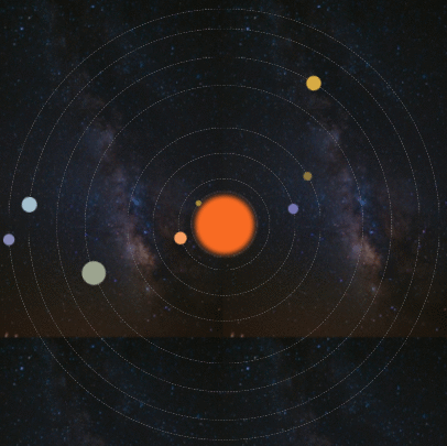
<h2>CSS 繪制太陽系各個行星運作軌迹</h2>
<div class="solarsys">
<!--太陽-->
<div class='sun'></div>
<!--水星軌道-->
<div class='mercuryOrbit'></div>
<!--水星-->
<div class='mercury'></div>
<!--金星軌道-->
<div class='venusOrbit'></div>
<!--金星-->
<div class='venus'></div>
<!--地球軌道-->
<div class='earthOrbit'></div>
<!--地球-->
<div class='earth'></div>
<!--火星軌道-->
<div class='marsOrbit'></div>
<!--火星-->
<div class='mars'></div>
<!--木星軌道-->
<div class='jupiterOrbit'></div>
<!--木星-->
<div class='jupiter'></div>
<!--土星軌道-->
<div class='saturnOrbit'></div>
<!--土星-->
<div class='saturn'></div>
<!--天王星軌道-->
<div class='uranusOrbit'></div>
<!--天王星-->
<div class='uranus'></div>
<!--海王星軌道-->
<div class='neptuneOrbit'></div>
<!--海王星-->
<div class='neptune'></div>
</div>
</body>
</html>
 CSS 繪制太陽系行星運作軌迹
![CSS 動畫專題(transition,animation,transform)1.目标及知識點:2.transition2.animation2.2 animation三個事件監聽: 3.transform 2D4.transform 3D5.requestAnimationFarme動畫幀6.Tween 動畫公式7.動畫架構mTween的使用8.動畫架構mTween示例—無縫滾動幻燈片[圖]](data:image/gif;base64,R0lGODlhAQABAIAAAP///wAAACwAAAAAAQABAAACAkQBADs=)