作者:潘宏熙
本文正在參加星光計劃3.0–夏日挑戰賽
前言
剛接觸鴻蒙開發不久,在最近接觸的一個項目中,發現有很多類似的消息提示彈窗。對項目所有彈窗進行分析,開發一個公共的消息彈窗元件
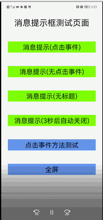
效果示範
元件說明
元件屬性定義
元件屬性
| 名稱 | 類型 | 預設值 | 必填 | 描述 |
|---|---|---|---|---|
| visible | object | {show: false} | 否 | 控制彈窗顯示狀态,由于現在的元件屬性沒有雙向綁定功能。是以采用對象格式,確定每次改變visible值的時候,元件都可以監聽到 |
| options | object | 無 | 是 | 彈窗顯示屬性,包括标題,内容,按鈕等,具體格式參考下面options屬性說明 |
元件options屬性
| 名稱 | 類型 | 預設值 | 必填 | 描述 |
|---|---|---|---|---|
| title | string | 無 | 否 | 彈窗标題 |
| content | string|string | 無 | 是 | 彈窗文本内容,當content為字元串類型顯示為單行文本,為字元串數組顯示為多行文本,單行文本會自動居中展示 |
| buttons | (string|button) | 無 | 否 | 彈窗标題,底部按鈕,具體屬性 最多顯示2個按鈕,如果超過2個後面部分自動舍去。具體格式參考下面button屬性說明 |
元件options屬性中的button屬性
| 名稱 | 類型 | 預設值 | 必填 | 描述 |
|---|---|---|---|---|
| text | string | 無 | 是 | 按鈕顯示文本,當button為string時,即為該屬性 |
| handle | function | 無 | 否 | 按鈕點選觸發事件,會在彈窗關閉後調用此事件 |
元件實作代碼
htm代碼:
<!-- index.hml -->
<dialog ref="messageBoxDialog">
    <div class="box">
        <div class="header {{!title?'no-title':''}}">
            <text class="header-text color-text">{{title}}</text>
        </div>
        <div class="content {{isTextCenter?'content-center':''}}">
            <text for="item in content" class="content-text color-text">{{item}}</text>
        </div>
        <div class="btn-bar {{!firstBtn.show?'no-btn':''}}">
            <button if="{{firstBtn.show}}" class="btn" type="text" @click="firstBtnClick">{{firstBtn.text}}</button>
            <divider if="{{secondBtn.show}}" vertical="true" class="btn-divider"></divider>
            <button if="{{secondBtn.show}}" class="btn" type="text" @click="secondBtnClick">{{secondBtn.text}}</button>
        </div>
    </div>
</dialog>
樣式代碼:
/* index.css */
.box{
    flex-direction: column;
    width: 100%;
}
.header {
    height: 56px;
    align-items: center;
    padding: 0px 24px;
    width: 100%;
}
.header-text {
    font-size: 20px;
}
.content {
    width: 100%;
    flex-direction: column;
    padding: 0px 24px;
}
.content-center {
    align-items: center;
}
.content-text {
    font-size: 16px;
    line-height: 20px;
}
.btn-bar{
    height: 56px;
    margin-top: 8px;
    padding: 0px 16px;
    justify-content: center;
}
.btn{
    height: 40px;
    background-color: #fff;
    width: 100%;
    border-radius: 0px;
}
.btn-divider {
    height: 40px;
    padding: 8px 0px;
    flex: 0 0 40px;
}
.no-title {
    height: 24px;
}
.no-btn {
    margin-top: 0px;
    height: 24px;
}
.color-text{
    color: rgba(0,0,0,0.9);
}
js代碼:
// index.js
export default {
    props: {
        // 屬性visible控制彈窗是否顯示
        visible:{
            default(){
                return {
                    show:false
                }
            }
        },
        // 屬性options彈窗顯示内容控制
        options: {
            default(){
                return {
                    content:''
                }
            }
        }
    },
    data : {
        // 元件内部記錄目前打開或關閉狀态
        isShow:false
    },
    // 對傳入的各種屬性進行邏輯處理
    computed:{
        title(){
            return this.options.title || ''
        },
        content(){
            const content = this.options.content
            if(Array.isArray(content)){
                return content
            }
            if(typeof content === 'string'){
                return [content]
            }
            return []
        },
        // 處理文本居中顯示邏輯
        isTextCenter(){
            const content = this.options.content
            if(Array.isArray(content)){
                return false
            }
            if(typeof content === 'string'){
                return  true
            }
            return false
        },
        firstBtn(){
            const buttons = this.options.buttons || [];
            const button = buttons[0];
            const butOpt = { show:true }
            if(button){
                if(typeof button === 'string'){
                    butOpt.text = button
                } else if(typeof button === 'object') {
                    butOpt.text = button.text
                    butOpt.handle = button.handle
                }else {
                    butOpt.show = false
                }
            }else{
                butOpt.show = false
            }
            return butOpt
        },
        secondBtn(){
            const buttons = this.options.buttons || [];
            const button = buttons[1];
            const butOpt = { show:true }
            console.log('secondBtn: ' + JSON.stringify(button))
            if(button){
                if(typeof button === 'string'){
                    butOpt.text = button
                } else if(typeof button === 'object') {
                    butOpt.text = button.text
                    butOpt.handle = button.handle
                }else {
                    butOpt.show = false
                }
            }else{
                butOpt.show = false
            }
            return butOpt
        }
    },
    onInit() {
        // 監聽visible屬性,控制彈窗打開或關閉
        this.$watch('visible', 'onVisibleChange');
    },
    onVisibleChange(val){
        if(val.show){
            if(!this.isShow){
                this.$refs.messageBoxDialog.show();
                this.isShow = true;
            }
        }else{
            if(this.isShow){
                this.$refs.messageBoxDialog.close();
                this.isShow = false;
            }
        }
    },
    firstBtnClick(){
        if(this.isShow){
            this.$refs.messageBoxDialog.close();
            this.isShow = false;
        }
        if(typeof this.firstBtn.handle === 'function'){
            this.firstBtn.handle()
        }
    },
    secondBtnClick(){
        if(this.isShow){
            this.$refs.messageBoxDialog.close();
            this.isShow = false;
        }
        if(typeof this.secondBtn.handle === 'function'){
            this.secondBtn.handle()
        }
    }
};
元件使用
在其他元件或頁面hml引入元件
<element name="message-box" src="../../component/message-box/index.hml"></element>
<div class="container">
    ...
    <message-box id="message-box-dialog" visible="{{visible}}" options="{{message}}"></message-box>
</div>
在其他元件或頁面js中如下使用
// 在data中定義元件屬性,具體屬性格式可以參考元件屬性定義
    data: {
        ...
        visible: {
            show:false
        },
        message:{
            content:''
        }
    },
    ...
    // 重新連接配接方法
    connect(){
        console.log('connect is called')
    }
    // 調用此方法可以在頁面打開彈窗
    openDialog(){
        this.message = {
            title:'連接配接失敗',
            content:[
                "1.請确認裝置電量充足,并處開機狀态請确認裝置電量充足,并處開機狀态",
                "2.将裝置靠近要連接配接的手機(10米以内)"
            ],
            buttons:['稍後再試',{text:'重新連接配接',handle:this.connect}]
        };
        this.visible = { show:true };
    },
    // 其他參數調用,隻有一個按鈕
    openDialog2(){
        this.message = {
            title:'配網失敗',
            content:[
                "1.檢查裝置是否接通電源",
                "2.請按開關鍵至ON",
                "3.再次碰一碰",
                "4.聽到“嘀”一聲提示音表示設定成功"
            ],
            buttons:['我知道了']
        }
        this.visible = {show:true};
    },
    // 無标題
    openDialog3(){
        this.message = {content:'檢查裝置是否接通電源檢',buttons:['我知道了']}
        this.visible = {show:true};
    },
    // 無按鈕,3秒後自動關閉
    openDialog4(){
        this.message = {title:'溫馨提示',content:'檢查裝置是否接通電源檢'}
        this.visible = {show:true};
        setTimeout(()=>{
            this.visible = {show:false};
        },3000)
    },
總結
以上就是消息彈窗元件開發以及使用的全部内容。此元件可以更加靈活的控制打開或關閉。也可以動态的顯示彈窗内容。
更多原創内容請關注:中軟國際 HarmonyOS 技術團隊
入門到精通、技巧到案例,系統化分享HarmonyOS開發技術,歡迎投稿和訂閱,讓我們一起攜手前行共建鴻蒙生态。
![自定義微信小程式下拉選擇框元件[圖]](data:image/gif;base64,R0lGODlhAQABAIAAAP///wAAACwAAAAAAQABAAACAkQBADs=)