接着重複這篇文章
Data Visualization and Analysis of Taylor Swift’s Song Lyrics
情感分析
情感分析是啥暫時不太關注,主要關注文章裡的資料可視化部分,按照文章中的代碼準備資料
lyrics<-read.csv("taylor_swift_lyrics_1.csv",header=T)
lyrics_text <- lyrics$lyric
lyrics_text<- gsub('[[:punct:]]+', '', lyrics_text)
lyrics_text<- gsub("([[:alpha:]])\1+", "", lyrics_text)
library(syuzhet)
help(package="syuzhet")
ty_sentiment <- get_nrc_sentiment((lyrics_text))
複制
gsub
函數是用來替換字元的,基本的用法是
> gsub("A","a","AAAbbbccc")
[1] "aaabbbccc"
複制
第一個位置是要替換的字元,第二個位置是替換成啥,第三個位置是完整的字元串。
第一個位置應該是可以用正規表達式的,但是R語言的正規表達式自己還沒有掌握
是以下面兩行代碼
lyrics_text<- gsub('[[:punct:]]+', '', lyrics_text)
lyrics_text<- gsub("([[:alpha:]])\1+", "", lyrics_text)
複制
幹了啥自己還沒看明白,原文的英文注釋是
removing punctations and alphanumeric content
get_nrc_sentiment()
應該是做情感分析的函數吧?
暫時先不管他了
将
ty_sentiment <- get_nrc_sentiment((lyrics_text))
運作完得到了一個資料框
> head(ty_sentiment)
  anger anticipation disgust fear joy sadness surprise trust
1     0            0       0    0   0       1        0     0
2     0            0       1    1   0       1        0     0
3     1            0       1    0   0       1        0     0
4     0            0       1    0   0       0        0     1
5     0            0       0    0   0       0        0     0
6     0            0       0    0   0       0        0     0
  negative positive
1        0        0
2        1        0
3        1        0
4        1        0
5        0        0
6        0        0
複制
構造接下來作圖用到的資料集
sentimentscores<-data.frame(colSums(ty_sentiment[,]))
head(sentimentscores)
names(sentimentscores) <- "Score"
sentimentscores <- cbind("sentiment"=rownames(sentimentscores),sentimentscores)
rownames(sentimentscores) <- NULL
複制
最終的資料集長這個樣子
> sentimentscores
      sentiment Score
1         anger   538
2  anticipation   760
3       disgust   427
4          fear   637
5           joy   956
6       sadness   684
7      surprise   429
8         trust   665
9      negative  1086
10     positive  1335
複制
ggplot2基本的柱形圖
library(ggplot2)
ggplot(data=sentimentscores,aes(x=sentiment,y=Score))+
  geom_bar(aes(fill=sentiment),stat = "identity")+
  theme(legend.position="none")+
  xlab("Sentiments")+ylab("Scores")+
  ggtitle("Total sentiment based on scores")+
  theme_minimal()
複制
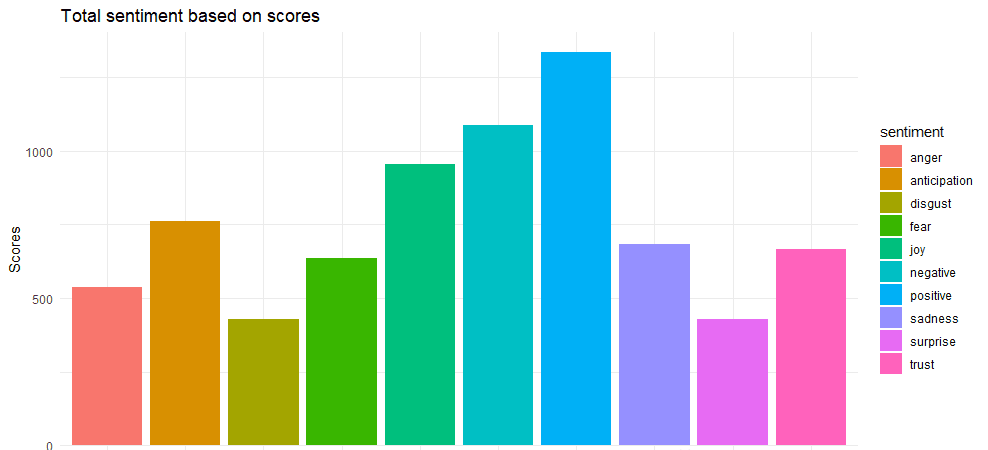
image.png
lyrics$lyric <- as.character(lyrics$lyric)
tidy_lyrics <- lyrics %>%
unnest_tokens(word,lyric)
song_wrd_count <- tidy_lyrics %>% count(track_title)
lyric_counts <- tidy_lyrics %>%
left_join(song_wrd_count, by = "track_title") %>%
rename(total_words=n)
lyric_sentiment <- tidy_lyrics %>%
inner_join(get_sentiments("nrc"),by="word")
複制
重複到這的時候遇到了報錯
是以下面自己構造資料集,可視化的結果就偏離真實情況了
lyric_counts$sentiment<-sample(colnames(ty_sentiment),
                               dim(lyric_counts)[1],
                               replace = T)
df<-lyric_counts%>%
  count(word,sentiment,sort=T)%>%
  group_by(sentiment)%>%
  top_n(n=10)%>%
  ungroup()
head(df)
head(lyric_counts)
複制
作圖
library(ggplot2)
png("1.png",height = 800,width = 1000)
ggplot(df,aes(x=reorder(word,n),y=n,fill=sentiment))+
  geom_col(show.legend = F)+
  facet_wrap(~sentiment,scales = "free")+
  coord_flip()+
  theme_bw()+
  xlab("Sentiments") + ylab("Scores")+
  ggtitle("Top words used to express emotions and sentiments")
dev.off()
複制

image.png
第二幅圖
df1<-lyric_counts%>%
  count(track_title,sentiment,sort = T)%>%
  group_by(sentiment)%>%
  top_n(n=5)
png(file="2.png",width=1300,height=700)
ggplot(df1,aes(x=reorder(track_title,n),y=n,fill=sentiment))+
  geom_bar(stat="identity",show.legend = F)+
  facet_wrap(~sentiment,scales = "free")+
  xlab("Sentiments") + ylab("Scores")+
  ggtitle("Top songs associated with emotions and sentiments") +
  coord_flip()+
  theme_bw()
dev.off()
複制
image.png
接下來是最想重複的一幅圖
year_emotion<-lyric_counts%>%
  count(sentiment,year)%>%
  group_by(year,sentiment)%>%
  summarise(sentiment_sum=sum(n))%>%
  ungroup()
head(year_emotion)
year_emotion<-na.omit(year_emotion)
grid.col = c("2006" = "#E69F00", "2008" = "#56B4E9",
             "2010" = "#009E73", "2012" = "#CC79A7",
             "2014" = "#D55E00", "2017" = "#00D6C9",
             "anger" = "grey", "anticipation" = "grey",
             "disgust" = "grey", "fear" = "grey",
             "joy" = "grey", "sadness" = "grey",
             "surprise" = "grey", "trust" = "grey")
circos.par(gap.after = c(rep(6, length(unique(year_emotion[[1]])) - 1), 15,
                         rep(6, length(unique(year_emotion[[2]])) - 1), 15))

chordDiagram(year_emotion, grid.col = grid.col, transparency = .2)
title("Relationship between emotion and song's year of release")
circos.clear()
複制
image.png
重複過程中遇到很多dplyr包中的函數,都是第一次使用,抽時間在回過頭來看這些函數的用法!