QML軸線圖示例,折線圖,散點圖。
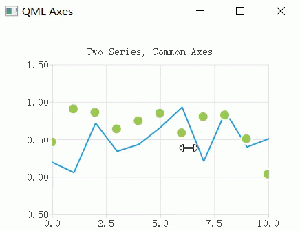
- 使用相同軸坐标的折線圖和散點圖。

代碼:
ChartView {
    title: "Two Series, Common Axes"
    anchors.fill: parent
    legend.visible: false
    antialiasing: true

    ValueAxis {
        id: axisX
        min: 0
        max: 10
        tickCount: 5
    }

    ValueAxis {
        id: axisY
        min: -0.5
        max: 1.5
    }

    LineSeries {
        id: series1
        axisX: axisX
        axisY: axisY
    }

    ScatterSeries {
        id: series2
        axisX: axisX
        axisY: axisY
    }
}

/* 添加動态資料 */
Component.onCompleted: {
    for (var i = 0; i <= 10; i++) {
        series1.append(i, Math.random());
        series2.append(i, Math.random());
    }
}
複制
- 使用DateTimeAxis構造的圖表用于顯示具有日期的曆史資料。
代碼:
ChartView {
    title: "Accurate Historical Data"
    anchors.fill: parent
    legend.visible: false
    antialiasing: true

    LineSeries {
        axisX: DateTimeAxis {
            format: "yyyy MMM"
            tickCount: 5
        }
        axisY: ValueAxis {
            min: 0
            max: 150
        }

        /* 請注意,JavaScript中的月份是以0為基礎的,是以2表示3月份. */
        XYPoint { x: toMsecsSinceEpoch(new Date(1950, 2, 15)); y: 5 }
        XYPoint { x: toMsecsSinceEpoch(new Date(1970, 0, 1)); y: 50 }
        XYPoint { x: toMsecsSinceEpoch(new Date(1987, 12, 31)); y: 102 }
        XYPoint { x: toMsecsSinceEpoch(new Date(1998, 7, 1)); y: 100 }
        XYPoint { x: toMsecsSinceEpoch(new Date(2012, 8, 2)); y: 110 }
    }
}

/* DateTimeAxis基于QDateTimes,
 * 是以我們必須将JavaScript日期轉換為毫秒,
 * 使它們與DateTimeAxis值比對。
 */
function toMsecsSinceEpoch(date) {
    var msecs = date.getTime();
    return msecs;
}
複制
- 使用CategoryAxis構造的圖表,使資料更易于了解。
代碼:
ChartView {
    title: "Numerical Data for Dummies"
    anchors.fill: parent
    legend.visible: false
    antialiasing: true

    LineSeries {
        axisY: CategoryAxis {
            min: 0
            max: 30
            CategoryRange {
                label: "critical"
                endValue: 2
            }
            CategoryRange {
                label: "low"
                endValue: 4
            }
            CategoryRange {
                label: "normal"
                endValue: 7
            }
            CategoryRange {
                label: "high"
                endValue: 15
            }
            CategoryRange {
                label: "extremely high"
                endValue: 30
            }
        }

        XYPoint { x: 0; y: 4.3 }
        XYPoint { x: 1; y: 4.1 }
        XYPoint { x: 2; y: 4.7 }
        XYPoint { x: 3; y: 3.9 }
        XYPoint { x: 4; y: 5.2 }
    }
}
複制
關于更多
- 相關連結
https://doc.qt.io/qt-5/qtcharts-qmlaxes-example.html 複制