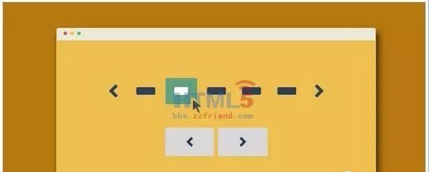
這是11款适合移動裝置使用 CSS3 分頁導覽列插件。你可以通過CSS或SASS檔案很容易的重新定制分頁導航的樣式。分頁導覽列的作用是使用者通過分頁連結來浏覽你的全部内容。一個可替代的方法是使用瀑布流布局,它們各有長處和短處。
HTML結構
所有的分頁導覽列DEMO的html結構都是一樣的:使用一個<nav>元素來包裹一個無序清單。清單項中的.button是前一頁和後一頁按鈕。
<nav role="navigation">
<ul class="cd-pagination no-space">
<li class="button"><a href="#0">Prev</a></li>
<li><a href="#0">1</a></li>
<li><a href="#0">2</a></li>
<li><a class="current" href="#0">3</a></li>
<li><a href="#0">4</a></li>
<li><span>...</span></li>
<li><a href="#0">20</a></li>
<li class="button"><a href="#0">Next</a></li>
</ul>
</nav> <!-- cd-pagination-wrapper -->
CSS樣式
最容易的改變分頁導覽列主題的方法是通過SASS。插件中提供了SASS檔案( _variables.scss),你可以通過變量來修改它們:
// colors
$color-1: #2E4057; // Pickled Bluewood
$color-2: #64a281; // Aqua Forest
$color-3: #ffffff; // White
// fonts
$primary-font: 'PT Sans', sans-serif;
// border-radius
$border-radius: .25em;
通過修改顔色變量你可以制作出很多不同效果的分頁導覽列。如果你不喜歡SASS,你可以通過style.css檔案來修改它們。
在例子中有一組(可選的)class可以用來改變分頁導覽列的樣式。這些class都被應用到<ul>元素上。 .cd-pagination類是基本的樣式,你不可以移除它。
最簡單的檢視這些分頁導覽列class的樣式的方法是看我們提供的demo,共有11種效果,下面是 .custom-icons 的例子:
/* --------------------------------
custom icons - customize the small arrow inside the next and prev buttons
-------------------------------- */
.cd-pagination.custom-icons .button a {
position: relative;
}
.cd-pagination.custom-icons .button:first-of-type a {
padding-left: 2.4em;
}
.cd-pagination.custom-icons .button:last-of-type a {
padding-right: 2.4em;
}
.cd-pagination.custom-icons .button:first-of-type a::before,
.cd-pagination.custom-icons .button:last-of-type a::after {
content: '';
position: absolute;
display: inline-block;
/* set size for custom icons */
width: 16px;
height: 16px;
top: 50%;
/* set margin-top = icon height/2 */
margin-top: -8px;
background: transparent url("../img/cd-icon-arrow-1.svg") no-repeat center center;
}
.cd-pagination.custom-icons .button:first-of-type a::before {
left: .8em;
}
.cd-pagination.custom-icons .button:last-of-type a::after {
right: .8em;
transform: rotate(180deg);
}
一些提示和建議
在小螢幕的移動裝置上,我們移除了numbers類,隻為分頁導航提供“前一頁”和“後一頁”。
可以在分頁導航的<a>元素上使用class .disabled來禁用某個連結。
class .current 用于高亮目前分頁導航的number連結。
隻有在和 .custom-icons 結合使用時, .animated-buttons 才起作用。另外,<a> 元素中的文字必須用<i> 元素來包裹
關于如何移除INLINE-BLOCK元素之間的空白的問題
這裡是一個小技巧。當你把清單元素設定為inline-block時,由于需要水準對齊它們,你會想到給它們一個margin值。這裡給出幾個你可以選擇的方案:
為清單項設定一個負的margin值。
讓所有的清單項都浮動起來(例如:float:left;)。但要記住為<ul>元素或它們父元素使用clearfix hack。
去除掉每一個清單項的關閉标簽 </li> 。這個方法看起來不可思議,但卻是一個十分好的解決方案。你可以參考DEMO4的分頁導覽列。
<nav role="navigation">
<ul class="cd-pagination no-space move-buttons custom-icons">
<li class="button"><a href="#0">Prev</a>
<li><a href="#0">1</a>
<li><a href="#0">2</a>
<li><a class="current" href="#0">3</a>
<li><a href="#0">4</a>
<li><span>...</span>
<li><a href="#0">20</a>
<li class="button"><a href="#0">Next</a>
</ul>
</nav> <!-- cd-pagination-wrapper -->
源碼示範/下載下傳請點選閱讀原文
↓↓↓↓↓↓