頂部狀态欄在日常中是必不可少的,今天和尚嘗試一下可折疊狀态欄的使用;
和尚以前在學習滑動沖突時曾用過 Sliver 系列的 Widget,和尚這次嘗試用 SliverAppBar 來處理;
SliverAppBar
源碼分析
const SliverAppBar({
    Key key,
    this.leading,
    this.automaticallyImplyLeading = true,
    this.title,
    this.actions,
    this.flexibleSpace,
    this.bottom,
    this.elevation,
    this.forceElevated = false,
    this.backgroundColor,
    this.brightness,
    this.iconTheme,
    this.textTheme,
    this.primary = true,
    this.centerTitle,
    this.titleSpacing = NavigationToolbar.kMiddleSpacing,
    this.expandedHeight,
    this.floating = false,
    this.pinned = false,
    this.snap = false,
})
複制
leading:頂部左側 Widget 常見的是傳回按鈕;
automaticallyImplyLeading:配合 leading 使用,若未設定 leading 且設為 false 時,标題位置整體向左移動,占據 leading 原本位置;
title:頂部标題 Widget 常見的是文字标題等;
centerTitle:true 為标題 Widget 居中,false 預設居左;
actions:頂部右側菜單組,可設定多個菜單按鈕等;
actions: <Widget>[
    Icon(Icons.add), Icon(Icons.info),
    Padding( child: Icon(Icons.delete), padding: EdgeInsets.symmetric(horizontal: 10.0))],
複制

elevation:滑動過程中标題欄與清單交界處;
forceElevated:與 elevation 共同使用,false 時不展示,true 時根據 elevation 設定效果展示;
如圖:
backgroundColor:背景色;
brightness:主題亮度,主要是 light 和 dark 兩種;
iconTheme:圖示主題,包括 leading / actions 等主題;
textTheme:文字主題,包括标題等,通常與上述兩種共同使用;
brightness: Brightness.dark,
iconTheme: IconThemeData(color: Colors.black26),
textTheme: TextTheme(title: TextStyle(color: Colors.black26)),
複制
primary:true 占據系統狀态欄位置,false 相反;
bottom:添加狀态欄底部小部件,需要是 PreferredSizeWidget 類型 Widget;
bottom: TabBar(tabs: [
   Tab(icon: Icon(Icons.border_left), text: '左側'),
   Tab(icon: Icon(Icons.border_clear), text: '居中'),
   Tab(icon: Icon(Icons.border_right), text: '右側')
], controller: TabController(length: 3, vsync: this)),
複制
expandedHeight:狀态欄展開高度;
flexibleSpace:狀态欄展開 Widget;
flexibleSpace: FlexibleSpaceBar(
    title: Text('标題'),
    background: Image.asset('images/icon_header.jpg', fit: BoxFit.cover),
    centerTitle: true),
複制
pinned:true滑動後固定折疊狀态欄,false 直接滑上去;
floating:滑動過程中效果,通常與 snap pinned 共同使用,且 floating 為 ture 時,snap 也一般為 true;官方推薦的樣例視訊很好的诠釋出滑動過程中清單的滑動與頂部狀态欄滑動變化;
- floating: false, pinned: false, snap: false
- floating: true, pinned: false, snap: false
- floating: true, pinned: false, snap: true
- floating: true, pinned: true, snap: false
- floating: true, pinned: true, snap: true
- floating: false, pinned: true, snap: false
class _SliverListPage extends State<SliverListPage> with TickerProviderStateMixin {
@override
Widget build(BuildContext context) {
return Scaffold(
body: CustomScrollView(slivers: <Widget>[
SliverAppBar(
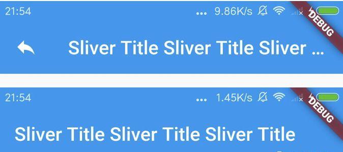
title: Text('Sliver Title Sliver Title Sliver Title'),
leading: Icon(Icons.reply),
automaticallyImplyLeading: true,
actions: <Widget>[
Icon(Icons.add), Icon(Icons.info),
Padding( child: Icon(Icons.delete), padding: EdgeInsets.symmetric(horizontal: 10.0)),
],
flexibleSpace: FlexibleSpaceBar(
title: Text('标題'),
background: Image.asset('images/icon_header.jpg', fit: BoxFit.cover),
centerTitle: true),
expandedHeight: 200,
backgroundColor: Colors.pinkAccent,
elevation: 16.0,
centerTitle: false,
primary: true,
floating: true,
pinned: false,
snap: true,
),
SliverList(
delegate: SliverChildBuilderDelegate(
(_, index) => ListTile(title: Text('目前 item 為: ${(index + 1)}'))))
]));
}
}
複制
SliverPersistentHeader
随着需求的不同,對折疊欄的樣式要求也不相同,接下來是和尚研究的重點,自定義折疊欄樣式;
源碼分析
const SliverPersistentHeader({
    Key key,
    @required this.delegate,
    this.pinned = false,
    this.floating = false,
})
複制
和尚主要實作 SliverPersistentHeaderDelegate;需要實作四個方法:
build 是頁面布局效果,其中 shrikOffset 為滑動距離,直到設定的折疊展開高度;
maxExtent 折疊狀态欄展開的最大高度;
minExtent 折疊狀态欄收起的最小高度(pinned=true);當 maxExtent=minExtent 時,狀态欄不折疊;
shouldRebuild 判斷是否與舊的不同,是否需要重繪;
class MySliverAppBar extends SliverPersistentHeaderDelegate {
  final double expandedHeight;
  MySliverAppBar({@required this.expandedHeight});

  @override
  Widget build(
      BuildContext context, double shrinkOffset, bool overlapsContent) {
    return Stack(fit: StackFit.expand, children: [
      Image.asset('images/icon_header.jpg', fit: BoxFit.cover),
      Center(
          child: Opacity(
              opacity: 1 - shrinkOffset / expandedHeight,
              child: Offstage(
                  child: _listHeaderWid(),
                  offstage: shrinkOffset <= 20.0 ? false : true))),
      Positioned(
          top: 20.0,
          child: Container(
              height: 45.0,
              width: MediaQuery.of(context).size.width,
              child: Opacity(
                  opacity: 1,
                  child: Padding(
                      padding: EdgeInsets.fromLTRB(20.0, 0.0, 20.0, 0.0),
                      child: Row(children: <Widget>[
                        Expanded( child: Text('測試應用', style: TextStyle( color: Color(0xFF333333), fontSize: 18.0))),
                        GestureDetector(
                            onTap: () {},
                            child: Padding(
                                padding: EdgeInsets.fromLTRB(0.0, 0.0, 20.0, 0.0),
                                child: Image.asset('images/icon_shelf_search.png', width: 22.0, height: 22.0))),
                        GestureDetector(
                            onTap: () async {},
                            child: Image.asset('images/icon_shelf_more.png', width: 22.0, height: 22.0))
                      ])))))
    ]);
  }

  Widget _listHeaderWid() {
    return Container(
        height: 84.0,
        margin: EdgeInsets.only(top: 75.0),
        child: Padding(
            padding: EdgeInsets.fromLTRB(20.0, 0.0, 20.0, 0.0),
            child: Row(children: <Widget>[
              Expanded(
                  flex: 1,
                  child: Column(
                      mainAxisAlignment: MainAxisAlignment.center,
                      mainAxisSize: MainAxisSize.max,
                      crossAxisAlignment: CrossAxisAlignment.start,
                      children: <Widget>[
                        Text('精彩世界', style: TextStyle(color: Colors.white, fontSize: 18.0)),
                        Padding(
                            padding: EdgeInsets.fromLTRB(0.0, 4.0, 0.0, 4.0),
                            child: Text('點選兌換獎勵', style: TextStyle( color: Colors.white, fontSize: 12.0)))
                      ])),
              Column(
                  mainAxisAlignment: MainAxisAlignment.center,
                  mainAxisSize: MainAxisSize.max,
                  crossAxisAlignment: CrossAxisAlignment.start,
                  children: <Widget>[
                    Container(
                        height: 32.0, width: 84.0,
                        decoration: BoxDecoration(
                            shape: BoxShape.rectangle,
                            gradient: LinearGradient(colors: <Color>[
                              Colors.orange, Colors.deepOrange ]),
                            borderRadius: BorderRadius.circular(50.0)),
                        child: Center( child: Text('簽到有獎', style: TextStyle( color: Colors.white, fontSize: 14.0))))
                  ])
            ])));
  }

  @override
  double get maxExtent => expandedHeight;

  @override
  double get minExtent => 75.0;

  @override
  bool shouldRebuild(SliverPersistentHeaderDelegate oldDelegate) => true;
}
複制
和尚對折疊狀态欄的認知還不夠深入,如有問題請多多指教!
來源:阿策小和尚
本文參與 騰訊雲自媒體分享計劃,歡迎熱愛寫作的你一起參與!
本文章分享自微信公衆号
阿策小和尚
作者:阿策小和尚
原始發表時間:2019-07-09
如有侵權,請聯系 [email protected] 删除。