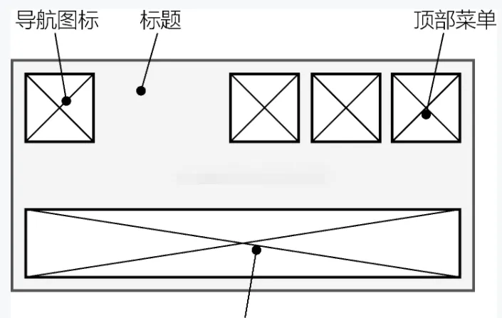
AppBar 元件的結構
AppBar 元件的代碼
AppBar(
  leading: Icon(Icons.home),    // 導航圖示
  title: Text('AppBar Title'),    // 頁面标題
  actions: <Widget>[            // 頂部菜單
    IconButton(
   onPressed: () {},
      icon: Icon(Icons.build),
    ),
    IconButton(
      onPressed: () {},
      icon: Icon(Icons.add),
    )
  ],
) 
頂部頁籤
// 混入SingleTickerProviderStateMixin
class _AppBarSampleState extends State<AppBarSample>
    with SingleTickerProviderStateMixin {

  // 存放各個可選項的數組
  List<Item> items = const <Item>[
    const Item(title: 'Item1', icon: Icons.directions_car),
    const Item(title: 'Item2', icon: Icons.directions_bike),
    const Item(title: 'Item3', icon: Icons.directions_boat),
    const Item(title: 'Item4', icon: Icons.directions_walk),
  ];

  // 建立切換控制器
  TabController _tabController;

  @override
  void initState() {
    super.initState();
    // 初始化控制器
    _tabController = TabController(length: items.length, vsync: this);
  }

  @override
  void dispose() {
    // 釋放資源
    _tabController.dispose();
    super.dispose();
  }

  @override
  Widget build(BuildContext context) {
    return Scaffold(
      // 頂部菜單欄
      appBar: AppBar(
          // ...
          bottom: TabBar(
            // 選項可滾動
              isScrollable: true,
            // 為TabBar配置控制器
            controller: _tabController,
            tabs: items.map((Item item) {
              // 根據資料傳回Tab元件
              return Tab(
                text: item.title,
                icon: Icon(item.icon),
              );
            }).toList(),
          )
     ),
        body: Center(
          child: Text('body'),
        ),
    );
  }
} body中使用TabBarView元件對應各個頁籤所關聯的主體視圖,它的children屬性接受一組元件來展示與每個頁籤對應的主體内容。
Scaffold(
  // 頂部菜單欄
  appBar: AppBar(
    // ...
    bottom: TabBar(
      controller: _tabController,
      tabs: items.map((Item item) {
        return Tab(
          text: item.title,
          icon: Icon(item.icon),
        );
      }).toList(),
    )),
  // Scaffold中的主體布局
  body: TabBarView(
    // 為TabBarView配置與TabBar相同的控制器
    controller: _tabController,
    children: items.map((Item item) {
      // 傳回選中相應選項時主體中顯示的元件
      return Center(
        child: Text(item.title, style: TextStyle(fontSize: 20.0),),
      );
    }).toList(),
  ),
) - 頁籤和主體内容的控制器都是 _tabController
抽屜菜單
- 左抽屜菜單 drawer
- 右抽屜菜單 endDrawer
class _DrawerSampleState extends State<DrawerSample> {

  @override
  Widget build(BuildContext context) {
    return Scaffold(
      appBar: AppBar(
        title: const Text('Drawer Demo'),
      ),
      drawer: MyDrawer(),
    );
  }
}

class MyDrawer extends StatelessWidget {
  @override
  Widget build(BuildContext context) {
    return Drawer(
      child: ListView(
        padding: EdgeInsets.zero,
        children: const <Widget>[
          DrawerHeader(
            decoration: BoxDecoration(
              color: Colors.blue,
            ),
            child: Text(
              '菜單頭部',
              style: TextStyle(
                color: Colors.white,
                fontSize: 24,
              ),
            ),
          ),
          ListTile(
            leading: Icon(Icons.message),
            title: Text('消息'),
          ),
          ListTile(
            leading: Icon(Icons.account_circle),
            title: Text('我的'),
          ),
          ListTile(
            leading: Icon(Icons.settings),
            title: Text('設定'),
          ),
        ],
      ),
    );
  }
} - ListTile元件的基本結構
- 為Scaffold元件指定drawer屬性後,AppBar就會自動生成一個導航圖示,單擊這個圖示後抽屜欄就會彈出。
自定義導航圖示
- automaticallyImplyLeading 為 false 時,不顯示導航圖示
Scaffold(
  appBar: AppBar(
    automaticallyImplyLeading: false,
    title: const Text('Drawer Demo'),
  ),
  drawer: MyDrawer(),
) - AppBar裡的 leading 可以自定義其他導航圖示
AppBar(
  leading: Icon(Icons.home),    // 導航圖示
  ……
)