上一篇中我們已經把元件的基礎架構和文檔的雛形搭建好了。下面我們從最簡單的 button icon vue3 vue3 compositionAPI vue2
項目根目錄建立 packages 檔案夾
建立 button 檔案夾
目錄結構如下:
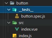
-
index.js
button
src
button
tests
src/index.vue
dom 中的文法結構和 vue2 相同,通過傳不同的參數,動态改變 class 名
<template>
  <button
    :class="[
      'd-button',
      type ? 'd-button--' + type : '',
      buttonSize ? 'd-button--' + buttonSize : '',
      {
        'is-disabled': disabled,
        'is-loading': loading,
        'is-plain': plain,
        'is-round': round,
        'is-circle': circle
      }
    ]"
    :disabled="disabled || loading"  // disabled 和 loading 時都不可點選
    :autofocus="autofocus"
    :type="nativeType"
    @click="handleClick"
  >
    <i v-if="loading" class="d-icon-loading"></i>
    <i v-if="icon && !loading" :class="'d-icon-' + icon"></i>
    <!-- v-if="$slots.default" 作用是防止span标簽占位有個小距離 -->
    <span v-if="$slots.default"><slot></slot></span>
  </button>
</template>
<script>
import { computed, defineComponent } from 'vue'
export default defineComponent({
name: 'DButton', // 注冊的元件名
props: {
type: {
type: String,
default: 'default',
validator: (val) => {
return [
'primary',
'success',
'warning',
'danger',
'info',
'text',
'default'
].includes(val)
}
},
size: {
type: String,
default: 'medium',
validator: (val) => {
return ['', 'large', 'medium', 'small', 'mini'].includes(val)
}
},
icon: {
type: String,
default: ''
},
nativeType: {
type: String,
default: 'button',
validator: (val) => {
return ['button', 'reset', 'submit'].includes(val)
}
},
loading: Boolean,
disabled: Boolean,
plain: Boolean,
autofocus: Boolean,
round: Boolean,
circle: Boolean
},
emits: ['click'], // 觸發父元件方法,不寫也可以,可以提示,也可以做校驗
setup(props, { emit }) { // 第二個參數 ctx 結構,這裡面沒有this
const buttonSize = computed(() => {
return props.size || 'medium'
})
const handleClick = (e) => {
emit('click', e)
}
// dom 中用到的字段都要傳回
return {
buttonSize,
handleClick
}
}
})
</script> 在
button/index.js
注冊元件
import DButton from './src/index.vue'
import '../../styles/button.scss'
// 如果是 ts 需要單獨給 install 定義類型
DButton.install = app => {
  app.component(DButton.name, DButton)
}
export default DButton
packages/index.js
中擷取所有元件進行注冊導出
import DButton from './button'
import '../styles/index.scss'
const components = [DButton]

const defaultInstallOpt = {
  size: 'medium',
  zIndex: 2000
}

const install = (app, options = {}) => {
  components.forEach(item => {
    app.component(item.name, item)
  })
  // 全局注冊預設資料
  app.config.globalProperties.$DAY = Object.assign(
    {},
    defaultInstallOpt,
    options
  )
}

export default {
  version: '1.0.0',
  install
}

export { DButton }
在 examples/main.js 中引入
import { createApp } from 'vue'
import App from './App.vue'
// 引入
import DayUI from '../packages'
const app = createApp(App)
// 注冊
app.use(DayUI).mount('#app')
界面中使用
<d-button>按鈕</d-button> 
button 單元測試
我們在建立項目的時候就選擇了使用
jest
測試,
vue
中使用的是
vue-jest
庫,配置檔案在
jest.config.js
中。下面開始書寫自己的單元測試
以下内容在 button/__tests__/button.spec.js 檔案中

// 傳回容器包含元件屬性資訊
import { mount } from '@vue/test-utils'
import Button from '../src/index.vue'

const text = '我是測試文本'

describe('Button.vue', () => {
  it('create', () => {
    const wrapper = mount(Button, {
      props: { type: 'primary' }
    })
    // 名稱中包含
    expect(wrapper.classes()).toContain('d-button--primary')
  })

  it('icon', () => {
    const wrapper = mount(Button, {
      props: { icon: 'search' }
    })
    expect(wrapper.find('.d-icon-search').exists()).toBeTruthy()
  })

  it('nativeType', () => {
    const wrapper = mount(Button, {
      props: { nativeType: 'submit' }
    })
    expect(wrapper.attributes('type')).toBe('submit')
  })

  it('loading', () => {
    const wrapper = mount(Button, {
      props: { loading: true }
    })

    expect(wrapper.classes()).toContain('is-loading')
    expect(wrapper.find('.d-icon-loading').exists()).toBeTruthy()
  })

  it('size', () => {
    const wrapper = mount(Button, {
      props: { size: 'medium' }
    })

    expect(wrapper.classes()).toContain('d-button--medium')
  })

  it('plain', () => {
    const wrapper = mount(Button, {
      props: { plain: true }
    })
    expect(wrapper.classes()).toContain('is-plain')
  })

  it('round', () => {
    const wrapper = mount(Button, {
      props: { round: true }
    })
    expect(wrapper.classes()).toContain('is-round')
  })

  it('circle', () => {
    const wrapper = mount(Button, {
      props: { circle: true }
    })
    expect(wrapper.classes()).toContain('is-circle')
  })

  it('render text', () => {
    const wrapper = mount(Button, {
      slots: {
        default: text
      }
    })

    expect(wrapper.text()).toEqual(text)
  })

  test('handle click', async () => {
    const wrapper = mount(Button, {
      slots: {
        default: text
      }
    })
    // trigger 操作原生的 dom 事件
    await wrapper.trigger('click')
    console.log(wrapper.emitted(), '---')
    // expect(wrapper.emitted()).toBeDefined()
    expect(wrapper.emitted().click).toBeTruthy()
  })

  test('handle click inside', async () => {
    const wrapper = mount(Button, {
      slots: {
        default: '<span class="inner-slot"></span>'
      }
    })
    await wrapper.element.querySelector('.inner-slot').click()
    expect(wrapper.emitted()).toBeDefined()
  })

  test('loading implies disabled', async () => {
    const wrapper = mount(Button, {
      slots: {
        default: text
      },
      props: { loading: true }
    })

    await wrapper.trigger('click')
    // loading 時無法點選
    expect(wrapper.emitted('click')).toBeUndefined()
  })

  it('disabled', async () => {
    const wrapper = mount(Button, {
      props: { disabled: true }
    })
    expect(wrapper.classes()).toContain('is-disabled')
    await wrapper.trigger('click')
    expect(wrapper.emitted('click')).toBeUndefined()
  })
}) - 執行指令 npm run test:unit
DButton
元件寫完了,
DIcon
元件就好寫了
同 button 檔案件建立 icon 目錄
以下代碼在 icon/src/index.vue 檔案中
<template>
  <!-- 這裡我是直接傳的最後一位,如果跟其他保持一緻,可以傳整個名稱  d-icon-name -->
  <i :class="`d-icon-${name}`"></i>
</template>

<script>
import { defineComponent } from 'vue'

export default defineComponent({
  name: 'DIcon',
  props: {
    name: String
  }
})
</script>
以下代碼在 icon/index.js 中
import DIcon from './src/index.vue'
import '../../styles/icon.scss'

DIcon.install = (app) => {
  app.component(DIcon.name, DIcon)
}

export default DIcon
pckages/index.js
中引入
icon
元件,小夥伴可自行添加,與
button
一緻,兩行代碼
編寫
icon
元件的測試檔案
以下代碼在 icon/__tests__/icon.spec.js 中

import { mount } from '@vue/test-utils'
import Icon from '../src/index.vue'

describe('Icon', () => {
  it('test', () => {
    const wrapper = mount(Icon, {
      props: {
        name: 'test'
      }
    })
    expect(wrapper.classes()).toContain('d-icon-test')
  })
})
在 examples 目錄中使用
到這裡主要的元件搭建就完成了,但是由于我們使用的編寫的元件庫,如果你建立的項目是js
項目,那麼下載下傳安裝ts
後就會day-ui
異常,是以我們需要編寫ts
的元件類型。day-ui
配置元件 ts 類型
typings
主要考慮的是給元件定義
install
方法,定義元件的
props
類型,類型的入口檔案是
index.d.ts
,如下:
// 最終對外使用的入口檔案類型
export * from './day-ui'
import * as DayUI from './day-ui'
export default DayUI
這裡簡單貼一個
button
元件的類型,詳細的大家可以去
github
看下哈
import { DayUIComponent, DayUIComponentSize } from './component.d'

// button type
export type ButtonType =
  | 'primary'
  | 'success'
  | 'warning'
  | 'danger'
  | 'info'
  | 'text'
  | 'default'

// native button type
export type ButtonNativeType = 'button' | 'submit' | 'reset'

// 寫 props 的類型, 繼承 install 方法
interface IButton extends DayUIComponent {
  // button size
  size: DayUIComponentSize
  // button type
  type: ButtonType
  // whether it's a plain button
  plain: boolean
  // whether it's a round button
  round: boolean
  // whether it's loading
  loading: boolean
  // disable the button
  disabled: boolean
  // button icon, accepts an icon name of element icon component
  icon: string
  // native buttion's autofocus
  autofocus: boolean
  // native button's type
  nativeType: ButtonNativeType
}

export const DButton: IButton
配置字型樣式檔案
上一節中我們已經把項目文檔基本結構搭建完畢,我們隻要把元件的配置添加進去即可。這裡為了友善,我把
css
樣式檔案放到了雲存儲空間中,我試過
github
的
raw
方式,但是無法通路,是以我使用了
uniCloud
的雲存儲空間,也比較簡單,下面簡單介紹下:
- 登入 uniCloud web 控制台(當然如果你之前沒用過 dcloud 的産品,可能需要認證) 連結
- 這裡建立服務空間, 阿裡雲目前免費的,存儲大小也沒有限制
- 點選進入存儲空間
- 我們可以把需要的檔案上傳,(也可以免費部署你自己的網站,也不用自己去購買伺服器)
- 配置參數中域名使用預設的就好
- 因為我們的文檔位址部署在github上,是以通路我們的樣式檔案會有跨域,繼續配置
配置文檔
以下代碼在 docs/.vitepress/config.js 中

// 這裡修改是打包後引入的本地檔案,我的檔案放在了項目根目錄,是以是 github 倉庫名
const base = process.env.NODE_ENV === 'production' ? '/day-ui-docs' : ''
const { resolve } = require('path')

module.exports = {
  title: 'day-ui',
  head: [
    // 全局樣式,引入樣式檔案
    [
      'link',
      {
        rel: 'stylesheet',
        href:
          'https://static-6e274940-2377-4243-9afa-b5a56b9ff767.bspapp.com/css/day-ui-style.css'
      }
    ]
  ],
  description: 'A Component For Vue3',
  // 掃描 srcIncludes 裡面的 *.md檔案
  srcIncludes: ['src'],
  alias: {
    // 為了能在demo中正确的使用  import { X } from 'day-ui'
    [`day-ui`]: resolve('./src')
  },
  base,
  themeConfig: {
    // logo: '../logo.svg',
    nav: [{ text: 'demo', link: '/math' }],
    lang: 'zh-CN',
    locales: {
      '/': {
        lang: 'zh-CN',
        title: 'day-ui',
        description: 'A Component For Vue3',
        label: '中文',
        selectText: '語言',
        nav: [{ text: '指南', link: '/' }],
        sidebar: [
          { text: '介紹', link: '/' },
          { text: 'Button 按鈕', link: '/components/button/' },
          { text: '按鈕組', link: '/components/buttonGroup/' },
          { text: 'Icon 圖示', link: '/components/icon/' },
          { text: '常見問題', link: '/components/issues/' }
        ]
      },
      '/en/': {
        lang: 'en-US',
        title: 'day-ui',
        description: 'A Component For Vue3',
        label: 'English',
        selectText: 'Languages',
        nav: [{ text: 'Guide', link: '/' }],
        sidebar: [
          { text: 'Getting Started', link: '/en/' },
          { text: 'Button', link: '/en/components/button/' },
          { text: 'ButtonGroup', link: '/components/buttonGroup/' },
          { text: 'Icon', link: '/en/components/icon/' },
          { text: 'Issues', link: '/en/components/issues/' }
        ]
      }
    },
    search: {
      searchMaxSuggestions: 10
    },
    // 右上角打開的倉庫位址
    repo: 'Bluestar123/day-ui-docs',
    repoLabel: 'Github',
    lastUpdated: true,
    prevLink: true,
    nextLink: true
  }
}
這裡我們寫下
icon
元件的文檔,
src
目錄下建立
icon
檔案夾
以下代碼在 index.zh-CN.md 檔案中,英文的大家自行解決了。。。
// 打包後的引用
---
map:
  path: /components/icon
---

# Icon 圖示

提供了常用的圖示合集

## 代碼示範

### 基本用法
// 這裡是做了 md 的源碼解析,識别路徑展示内容
<demo src="./demo/demo.vue"
  language="vue"
  title="基本用法"
  desc="i 标簽直接通過設定類名為 d-icon-iconName 來使用即可。也可以直接使用 d-icon 元件,傳入 name 屬性">
</demo>

### 更多圖示名稱參考 element-plus

- [位址](https://element-plus.org/#/zh-CN/component/icon)

## Props

| 參數 | 說明 |   類型 |         值 |
| ---- | ---: | -----: | ---------: |
| name | 名稱 | string | 例如'edit' |
index.vue
中的代碼就是元件的代碼,因為我們這裡不下載下傳包,是以就是元件源碼。
以下代碼在 demo.vue 中,這裡大家可以随便寫了

<template>
  <div>
    <i class="d-icon-edit"></i>
    <i class="d-icon-share"></i>
    <i class="d-icon-delete"></i>
    <d-icon name="setting"></d-icon>
  </div>
</template>

<script lang="ts">
import { DIcon } from 'day-ui'
import { defineComponent } from 'vue'

export default defineComponent({
  components: {
    DIcon
  }
})
</script>
<style lang="scss" scoped>
i + i {
  margin-left: 10px;
}
</style>
我們的文檔就實作了,還能看到的我們引入的檔案
下一節我們開始元件庫打包環境配置,釋出到
npm
上,如果那裡寫的有問題歡迎指正!如果對您有幫助的話歡迎評論轉發!