taroPop自定義彈層元件|Modal框|dialog對話框|仿微信/ios/android對話框
實作了自定義多種彈窗類型(msg/toast/ios/android)/彈窗樣式、支援多個按鈕事件/按鈕樣式、自動關閉、遮罩層、彈窗位置及自定義slot模闆
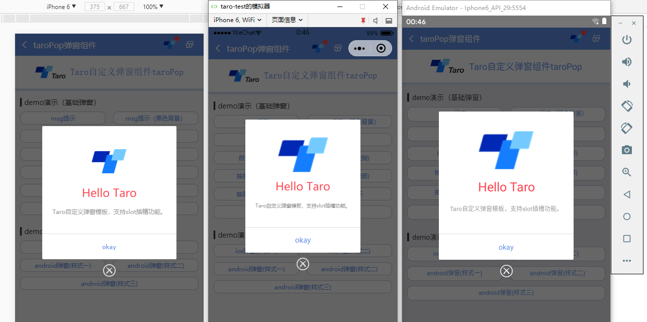
如下圖:H5+小程式+ReactNative端效果
支援以下自定義參數配置:
static defaultProps = {
    isVisible: false,       //彈窗顯示

    title: '',              //标題
    content: '',            //内容
    contentStyle: null,     //内容樣式
    style: null,            //自定義彈窗樣式
    skin: '',               //彈窗風格
    icon: '',               //彈窗圖示
    xclose: false,          //自定義關閉按鈕

    shade: true,            //遮罩層
    shadeClose: true,       //點選遮罩關閉
    opacity: '',            //遮罩透明度
    time: 0,                //自動關閉時間
    end: null,              //銷毀彈窗回調函數

    position: '',           //彈窗位置顯示

    btns: null,             //彈窗按鈕 [{...args}, {...args}]
}
元件用法:
在頁面引入自定義模态框元件
import TaroPop from '@components/taroPop'
import Taro from '@tarojs/taro'
import { View, Text } from '@tarojs/components'

// 引入彈窗元件
import TaroPop from '@components/taroPop'

export default class TaroPopDemo extends Taro.Component {
    ...

    render() {
        return (
            <View className="taro-container">
                ...

                {/* 彈窗模闆 */}
                <TaroPop ref="taroPop" />
            </View>
        );
    }
}
通過如下方式調用元件内show及close方法
this.refs.taroPop.show({...options})
this.refs.taroPop.close()
- msg消息框效果

react+taro多端對話框|仿微信/taro-ui彈窗效果
this.refs.taroPop.show({
    content: 'Taro消息提示框(3s後視窗關閉)',
    shade: true,
    shadeClose: true,
    time: 3,
    anim: 'fadeIn',
}) - ios彈窗效果
react+taro多端對話框|仿微信/taro-ui彈窗效果
let taroPop = this.refs.taroPop
taroPop.show({
    skin: 'ios',
    title: '消息提示',
    content: 'ios彈窗效果 (彈窗内容,用于告知目前狀态、提示資訊和解決方法,描述文字/文案盡量控制在三行内)',
    shadeClose: false,

    btns: [
        {
            text: '取消',
            style: {color: '#6190e8'},
            onClick() {
                taroPop.close()
            }
        },
        {
            text: '不再提醒',
            style: {color: '#6190e8'},
            onClick() {
                console.log('您點選了前往設定!')
            }
        }
    ]
}) 調用方式和上面一樣,不過是不同的參數配置不同而已。
/**
 * @Title     Taro自定義彈窗元件 - taroPop.jsx
 * @Time      andy by 2019-11-28
 */

import Taro from '@tarojs/taro'
import { View, Text, Image } from '@tarojs/components'
import { Modal, ActivityIndicator, TouchableHighlight } from 'react-native'
import classNames from 'classnames'
import './index.scss'

export default class TaroPop extends Taro.Component {
    /**
     * @ 彈窗預設配置
     */
    static defaultProps = {
        isVisible: false,       //彈窗顯示

        title: '',              //标題
        content: '',            //内容
        contentStyle: null,     //内容樣式
        style: null,            //自定義彈窗樣式
        skin: '',               //彈窗風格
        icon: '',               //彈窗圖示
        xclose: false,          //自定義關閉按鈕

        shade: true,            //遮罩層
        shadeClose: true,       //點選遮罩關閉
        opacity: '',            //遮罩透明度
        time: 0,                //自動關閉時間
        end: null,              //銷毀彈窗回調函數

        anim: 'scaleIn',        //彈窗動畫
        position: '',           //彈窗位置顯示

        btns: null,             //彈窗按鈕 [{...args}, {...args}]
    }

    constructor(props) {
        super(props)
        this.state = {
            ...this.props,
        }
        this.timer = null
    }


    /**
     * @ 顯示彈窗事件
     */
    show = (options) => {
        this.setState({
            ...this.props, ...options, isVisible: true
        })
    }

    /**
     * @ 關閉彈窗事件
     */
    close = () => {
        this.setState({...this.props})

        this.timer && clearTimeout(this.timer)
        delete this.timer

        typeof this.state.end === 'function' && this.state.end.call(this)
    }

    ...

    render() {
        let { isVisible, title, content, contentStyle, style, skin, icon, xclose, shade, shadeClose, opacity, time, end, anim, position, btns } = this.state

        let taroEnv = process.env.TARO_ENV

        ...

        // 渲染H5、RN模闆
        const renderTpl = (
            <View className="taroPop">
                {/* 遮罩 */}
                {shade ? <View className="atpop__ui_mask" style={{opacity: opacity == '' ? .6 : opacity}} onClick={this.shadeClick} /> : null}
                {/* 窗體 */}
                <View className="atpop__ui_main">
                    <View className={classNames('atpop__ui_child', skin && 'atpop__' + skin, position && 'atpop__ui_child-' + position)} style={style}>
                        {/* 标題 */}
                        {title ? <Text className={classNames('atpop__ui_tit', skin && 'atpop__ui_tit-' + skin)}>{title}</Text> : null}
                        {/* 内容 */}
                        {content ? <View className="atpop__ui_cnt">
                            {/* toast内容 */}
                            {icon && skin === 'toast' ?
                                <View className="atpop__ui_toast">
                                    {icon === 'loading' && taroEnv === 'rn' ?
                                    <ActivityIndicator color="rgba(255,255,255,.5)" size={24} /> : <Image className={classNames('atpop__ui_toast-img', icon=='loading' && 'atpop__ui_toast-img-loading')} src={toastIcon[icon]} mode="aspectFit" />
                                    }
                                </View>
                                :
                                null
                            }
                            {/* 文本内容 */}
                            <Text className={classNames('atpop__ui_cntxt', skin && 'atpop__ui_cntxt-' + skin)} style={contentStyle}>{content}</Text>
                        </View>
                        :
                        this.props.children
                        }
                        {/* 按鈕 */}
                        {btns ? <View className={classNames('atpop__ui_btns', skin && 'atpop__ui_btns-' + skin)}>
                            {btns.map((item, i) => {
                                return taroEnv === 'rn' ?
                                <TouchableHighlight className={classNames('atpop__ui_btn', skin && 'atpop__ui_btn-' + skin)} activeOpacity={1} underlayColor='rgba(200,200,200,.3)' key={i} onPress={item.onClick}>
                                    <Text className={classNames('atpop__ui_btntxt', skin && 'atpop__ui_btntxt-' + skin)} style={item.style}>{item.text}</Text>
                                </TouchableHighlight>
                                :
                                <View className={classNames('atpop__ui_btn', skin && 'atpop__ui_btn-' + skin)} key={i} onClick={item.onClick}>
                                    <Text className={classNames('atpop__ui_btntxt', skin && 'atpop__ui_btntxt-' + skin)} style={item.style}>{item.text}</Text>
                                </View>
                            })}
                        </View>
                        :
                        null
                        }
                    </View>
                    {/* xclose */}
                    {xclose ? <View className="atpop__ui_xclose" onClick={this.close}><Image className="atpop__ui_xclose-img" src={require('./skin/error.png')} mode="aspectFit" /></View> : null}
                </View>
            </View>
        )

        // 渲染窗體
        if (taroEnv === 'rn') {
            return (
                <Modal transparent={true} visible={isVisible} onRequestClose={this.close}>
                    {renderTpl}
                </Modal>
            )
        }else if (taroEnv === 'h5' || taroEnv === 'weapp'){
            return isVisible && renderTpl
        }
    }
}
另外編譯到RN需要特别注意樣式問題,flex布局及最好使用BEM命名規則。
let taroEnv = process.env.TARO_ENV

// 渲染窗體
if (taroEnv === 'rn') {
    return (
        <Modal transparent={true} visible={isVisible} onRequestClose={this.close}>
            {renderTpl}
        </Modal>
    )
}else if (taroEnv === 'h5' || taroEnv === 'weapp'){
    return isVisible && renderTpl
}
像上面,taro還提供了對于不同端環境變量判斷,另外RN端使用到了Modal元件包裹。
到這裡就基本介紹完了,後續會繼續放送一些分享執行個體。👦👦