flex 布局,我相信大家都非常熟悉, 但是要說到 flex:1 表達的含義,我相信很多同學說不出來。
很多同學入門flex 的時候,應該都是看了 阮一峰的flex 科普文章
阮一峰對 flex 科普文章
想要梳理清晰flex:1的含義,我們先學習下flex 這個css屬性表達了哪些含義
flex屬性是flex-grow, flex-shrink 和 flex-basis的簡寫,預設值為0 1 auto。後兩個屬性可選。
從這裡就可以推導出
flex: 1
相當于
flex: 1 1 auto.
我一開始了解的也是這樣。後面的分析會推翻我這裡的結論
flex-basis 也是一個比較難了解的點,我寫了深入了解flex-basis來梳理這個知識點,不懂得可以檢視。這裡我們重點解析flex:1。
我寫了一個簡單的demo 來提供分析:
<!DOCTYPE html>
<html lang="en">
<head>
   <meta charset="UTF-8">
   <meta http-equiv="X-UA-Compatible" content="IE=edge">
   <meta name="viewport" content="width=device-width, initial-scale=1.0">
   <title>Document</title>
   <style>
       html, body {
           margin: 0;
       }
       .container {
           display: flex;
           width: 100%;
       }

       .c1 {
           background-color: green;
           flex:1;
       }
       .c2 {
           background-color: red;
            flex:1;
       }
       .c3 {
           background-color: wheat;
           flex:1;
       }
   </style>
</head>
<body>
   <div class="container">
       <div class="c1">啦啦啦啦啦啦啦啦啦啦啦啦啦啦啦啦啦啦</div>
       <div class="c2">啦啦啦啦啦啦</div>
       <div class="c3">啦</div>
   </div>
</html>
我們看下浏覽器輸出的效果:
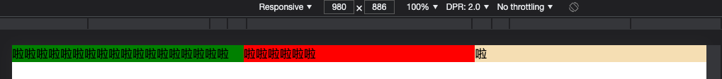

可以看到,無論内容是多少,我們都實作等分。
我們看下控制台:
發現:
flex: 1
其實相當于:
flex-grow: 1
flex-shrink: 1
flex-basix: 0%
看另一個例子:
.c1 {
            background-color: green;
            flex: 1 1 20%;
        }
        .c2 {
            background-color: red;
            flex: 1 1 20%;
        }
        .c3 {
            background-color: wheat;
            flex: 1 1 20%;
        }
浏覽器顯示效果:
依然是等分
再來一個類似的例子:
.c1 {
            background-color: green;
            flex: 1 1 10;
        }
        .c2 {
            background-color: red;
            flex: 1 1 10;
        }
        .c3 {
            background-color: wheat;
            flex: 1 1 10;
        }
從以上的分析調試,我們可以初步分析
- flex: 1 浏覽器裡解析的是 1 1 0%, 實作的效果是所有元素等分
- flex-basic 隻要是 (number類型 + 機關),實作的效果都是等分
接下來,看下 flex: 1 1 auto 的效果
.c1 {
            background-color: green;
            flex: 1 1 auto;
        }
        .c2 {
            background-color: red;
            flex: 1 1 auto;
        }
        .c3 {
            background-color: wheat;
            flex: 1 1 auto;
        }
沒有等分
總結
寫到這裡,我們在細細品味下flex-basic的含義
flex-basis屬性定義了在配置設定剩餘空間之前,項目占據的主軸空間(main size)。浏覽器根據這個屬性,計算主軸是否有多餘空間。
剩餘的空間 = 總的width - c1.width - c2.width - c3.width
.c1 {
          background-color: green;
            flex: 1 1 10px;
        }
        .c2 {
            background-color: red;
            flex: 1 1 10px;
        }
        .c3 {
            background-color: wheat;
            flex: 1 1 10px;
        }
剩餘的空間 = 父width - c1.width - c2.width - c3.width